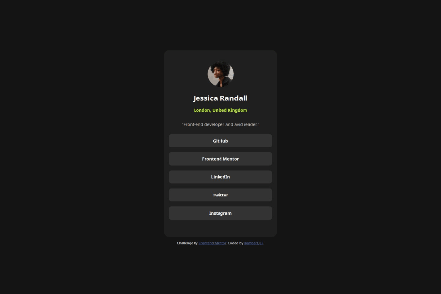
Design comparison
Solution retrospective
Nothing much, I'm just very familiar with flex now so I can be proud of that !
What challenges did you encounter, and how did you overcome them?I had problem setting up the "GitHub, Linkedin, Frontend Mentor..." items background-color because the box was too small at the beginning so I had to find a way to edit it and avoid destroying everything around my items.
What specific areas of your project would you like help with?Maybe CSS, I'm sure I could organize my CSS in an easier way.
Community feedback
- @alan-mesquitaPosted about 1 year ago
Fala Tom!
Sua solução ficou muito boa!
Tenho uma sugestão para você:
Para deixar seu HTML mais semântico você pode estar estudando um pouco mais sobre listas ordenadas e listas desordenadas mais conhecidas como ol e ul.
Da um confere nesses links depois: https://www.w3schools.com/tags/tag_ul.asp https://www.w3schools.com/tags/tag_ol.asp https://www.w3schools.com/tags/tag_li.asp
Espero que seja útil pra você nos próximos projetos! 🚀😊
Fora isso, ótimo trabalho!
1
Please log in to post a comment
Log in with GitHubJoin our Discord community
Join thousands of Frontend Mentor community members taking the challenges, sharing resources, helping each other, and chatting about all things front-end!
Join our Discord
