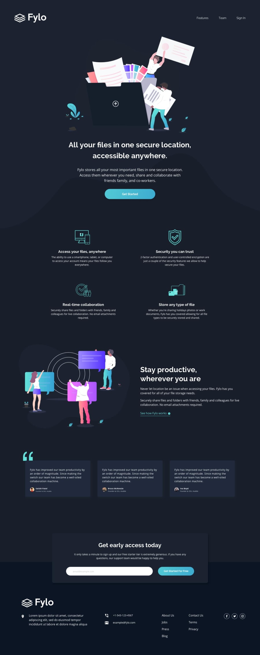
Design comparison
Solution retrospective
Any suggestions most welcome!
Community feedback
- @ApplePieGiraffePosted over 3 years ago
Hey there, Pritam Tirpude! 👋
Nice job on this challenge! 👏
One thing I noticed is that space between sections of the page varies quite a bit depending on the dimensions of the screen (meaning at some points, there might be too much/too little space between sections, depending on the size of the viewport). You might want to consider using more fixed values or allowing elements to be sized more by the content inside them so the layout of the page remains more or less consistent across screen sizes. 😉
And I believe the social media icons in the footer of the page would be better wrapped in anchor tags (rather than
<button>elements) since they are, well, links. 🙂Keep coding (and happy coding, too)! 😁
0 - @srikartopellaPosted over 3 years ago
This is solely my opinion . No offence , But links tags shouldn't be bold they either look good by changing opacity while in hover state or color change . This is a problem because it makes surrounding anchor tags pop out a little bit . I don't know whether it is a design by front-end mentor or your own thought. But Believe me it doesn't work but without that This site was perfect in every angle. Good job Bud
0
Please log in to post a comment
Log in with GitHubJoin our Discord community
Join thousands of Frontend Mentor community members taking the challenges, sharing resources, helping each other, and chatting about all things front-end!
Join our Discord
