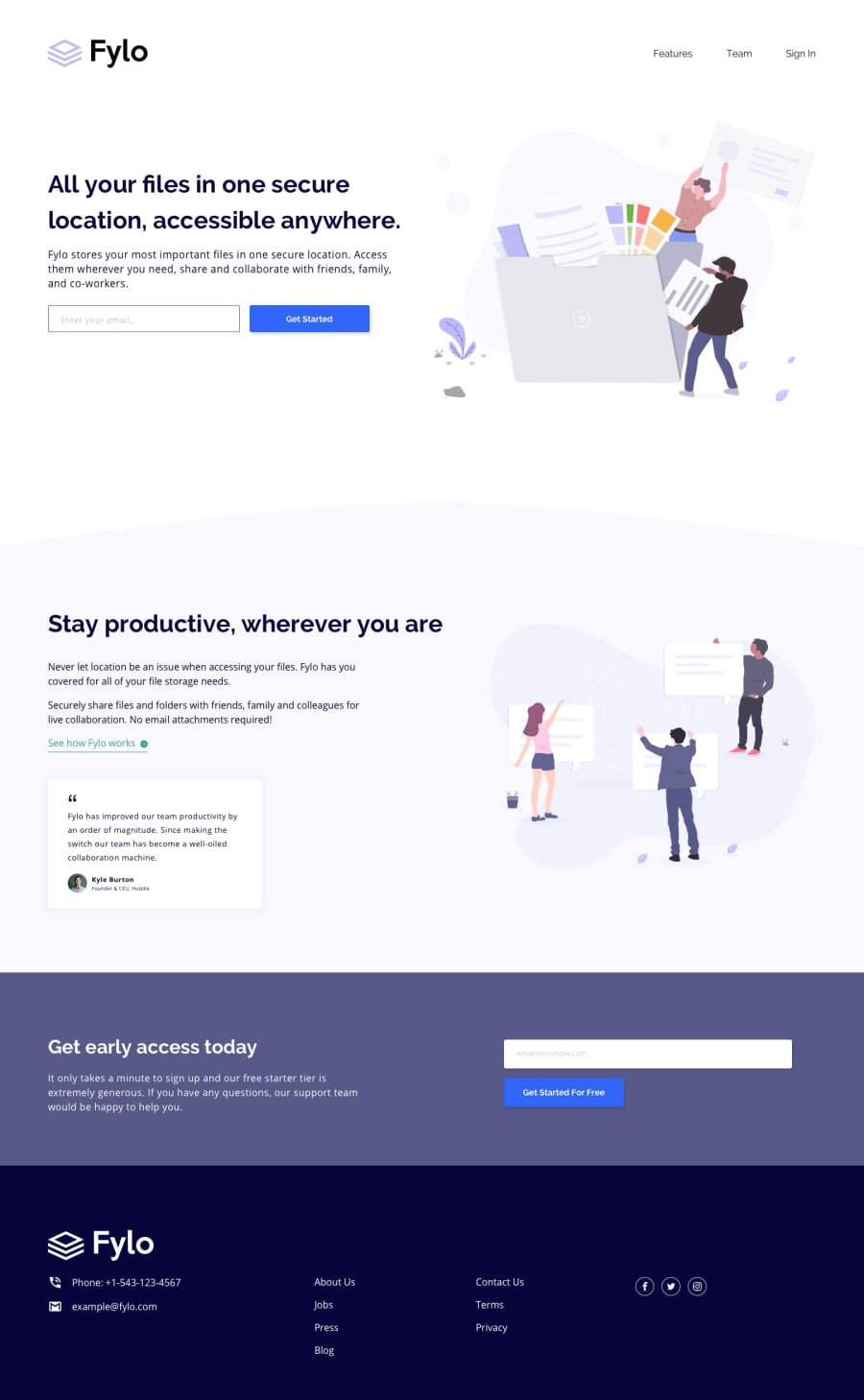
Design comparison
Community feedback
- @grace-snowPosted over 3 years ago
Hi
This doesn't look finished yet to me. Did you definitely push up your latest code?
Try to pay attention to all details in Design like alignment, sizing, spacing, container max-widths, logo color etc. Take your time and keep going until its all done.
Good luck
0@grace-snowPosted over 3 years agoAfter looking at the code can I ask how many other smaller ui challenges you've already done? Looking at this, I think you've missed a few foundations and may have jumped ahead of yourself a little...
In html I recommend
- rewriting all alt text. None of it is helpful or readable at the moment. Logo needs to say product/site name and probably
- homeas its inside an anchor tag. All others need to readable descriptions of the images, not hyphenated if you are going to include alt text - adding labels to forms. Although youve used label elements there is no text in there for assistive tech to read. Look up how to do this
- make sure there's no text in spans alone, always in a meaningful element
- social icons need to be inside labelled anchor tags
I can't assess css on this as you've not included an unminified version. I can see in it you are heavily nesting css selectors though, which will cause big specificity problems and is considered bad practice - try to use single class selectors where possible
I hope the first few tips help anyway
0@soitirakisPosted over 3 years ago@grace-snow thank you very much for the review. I will take in consideration everything pointed out, and I will try to fix them all. Thank you so much again
0 - rewriting all alt text. None of it is helpful or readable at the moment. Logo needs to say product/site name and probably
Please log in to post a comment
Log in with GitHubJoin our Discord community
Join thousands of Frontend Mentor community members taking the challenges, sharing resources, helping each other, and chatting about all things front-end!
Join our Discord
