

Design comparison

Solution retrospective
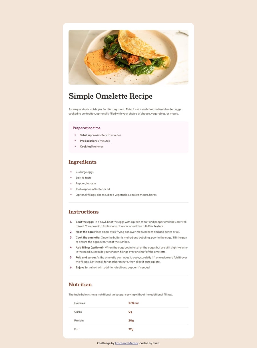
It looks pretty much like the design. I wouldn't do much different next time.
What challenges did you encounter, and how did you overcome them?The padding didn't work on the row of the table. So finally i tried it on the cells themselves and it work. And i needed to think what the best way was for the image to get it full width for the mobile version.
What specific areas of your project would you like help with?Just getting feedback of what i could do better next time.
Community feedback
- @contrebassesPosted 3 months ago
I don't have much to say. This looks really good. The code is very clean and readable. The image has an alt text. I was actually really inspired by your code and I will refer back to it in the future to learn to write cleaner code. I like the stars. My only criticism would be that the list-item markers for the ingredients are supposed to be brown, unless I'm mistaken.
0P@Sven-27Posted 3 months ago@contrebasses thank you for you great feedback. I thought i made them brown. Maybe i used the wrong color by accident.
0

Please log in to post a comment
Log in with GitHubJoin our Discord community
Join thousands of Frontend Mentor community members taking the challenges, sharing resources, helping each other, and chatting about all things front-end!
Join our Discord