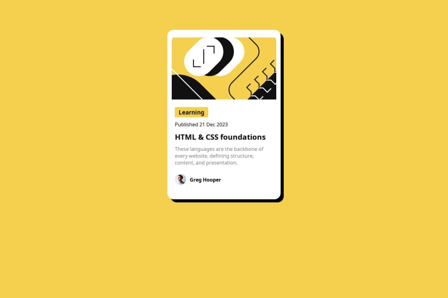
Design comparison
Solution retrospective
Items positioning was kind off tricky.
What specific areas of your project would you like help with?Using Flex and grid system for better design.
Community feedback
- @z-mnPosted 9 months ago
Good job! In order to center the card, you should target the body and set min-height: 100vh, then use display: grid and place-items: center. Your solution is otherwise good excluding the minor font size and line height differences, and the missing border. Happy coding!
Marked as helpful1@KingSlayer3xPosted 9 months ago@z-mn Thank you very much! that was very helpful. Happy coding.
0 - @rineliniguezsosaPosted 9 months ago
In your main container, align the items to the center and justify the content to the center in the same way. In the figma file, the text size, the internal padding, and the dimensions of the image appear.
0@KingSlayer3xPosted 9 months ago@rineliniguezsosa Thank you! I don't have the full access to the Figma file! 😥
0
Please log in to post a comment
Log in with GitHubJoin our Discord community
Join thousands of Frontend Mentor community members taking the challenges, sharing resources, helping each other, and chatting about all things front-end!
Join our Discord
