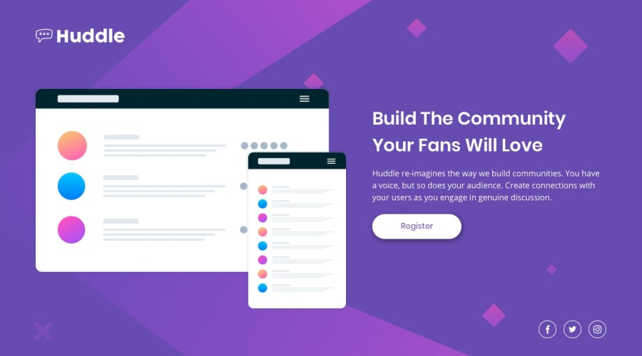
Design comparison
SolutionDesign
Solution retrospective
I await your comments and criticism, do not hesitate, I ask that I improve myself
Community feedback
- @andreasremdtPosted about 2 years ago
Hey @mclanecorp,
Congrats on solving the challenge! I like the fact that you used semantic HTML, considered accessibility, and don't have any HTML issues in your solution. Also, it's not far from the design. A couple of things you could improve:
- Use focus styles for keyboard users. Right now, your interactive elements only have hover styles, which can hurt accessibility.
- You've imported many different web fonts in
styles.css, but only use 2 of them.@importstatements are expensive performance-wise, so it's advisable to use them as sparingly as possible and without loading resources you don't need. - You could improve your layout by centering everything on the page. One easy way is to wrap the entire application code in a
div.container, set amax-widthand align everything inside the body using the below code:
body { display grid; place-items: center; min-height: 100vh;- Try using other CSS units, such as
emorrem, especially for sizing and spacing. These units are more flexible when it comes to zoomed in viewports and scaling your UI based on font size. This video gives a good explanation of choosing the right units. - You don't need to wrap your button in a
div, this element can be removed. - On smaller screen sizes, the footer icons are stuck to the bottom. Giving them some more spacing would improve the design.
Hope this helps, let me know if you have any questions :)
Marked as helpful1
Please log in to post a comment
Log in with GitHubJoin our Discord community
Join thousands of Frontend Mentor community members taking the challenges, sharing resources, helping each other, and chatting about all things front-end!
Join our Discord
