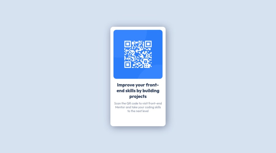
Design comparison
Solution retrospective
Give me your feedback about this little code. thank you
Community feedback
- @correlucasPosted over 2 years ago
👾Hello Miassa, congratulations for your solution!
I saw that you've found the way to put the live site on, thats good!
I've some tips about your solution:
1.You've set some value for the container
heightfor this reason when the container stretch the text elements start to pop out the container due the fixedheightvalue, to fix that just delete the container height, in this case the height comes from the inner elements and its padding.2.You've used margin auto to align the container, and this works, indeed the container is centered, but note that this margin created a huge gap between the screen border and the container, forcing the container to contract much more than it should. My advice for you is to tdo this alignment using
display: flex;using it in the body / container, its better thanmarginandposition relativefor alignment.Hope it helps, and congrats for you first challenge ever!
Keep it up!
1@Miassa35Posted over 2 years ago@correlucas yes i found it thanks, so: for the 1st tip, i totally agree and i corrected it; teh 2nd tip: i didnt get it when you said "that this margin created a huge gap between the screen border and the container" because i used the tip of diplsay flex in the parent (body) and margin: auto in the child(.QR_container) to align vertically the container, i already align it with flexbox , justify-content and align-content and it give me the same result. ps: i didn't use position relative .
0@correlucasPosted over 2 years ago@Miassa35 Ah ok, sorry, I said that because often I see person doing this alignment with
position: relative;now I saw that you've aligned everything with themargin: auto;that's fine, my bad.Look the code below, I did some changes in your code, and was that I wanted to say:
body {
    /* display: flex; */
    /* width: 100vw; */
    height: 100vh;
    background-color: hsl(212, 45%, 89%);
    display: flex;
    align-items: center;
    justify-content: center;
}


.QR_container {
    display: flex;
    max-width: 350px;
    /* height: 65%; */
    /* margin: auto; */
    padding: 1em;
    background-color: white;
    border-radius: 15px;
    text-align: center;
    box-shadow: 5px 5px 40px hsl(220deg 15% 55%);
    flex-direction: column;
    align-items: center;
    justify-content: center;
}
0 - @rohitd99Posted over 2 years ago
Hi Miassa , firstly wonderful solution it fits the design and it is also responsive
I'd like to highlight some issues here:
- As we go towards mobile view your image seems to change its size but the text doesn't so you might want to write some media queries or go for font-size in
rem or em.
2.For the accessibility issues include a main tag or suppose it's breaking after adding a main tag add
role="main"to your class QR_container. And for the other one addrole="article"or any other appropriate role. You might want to search about search about ARIA roles.All in all wonderful solution . Keep it up .
0@Miassa35Posted over 2 years ago@rohitd99 thank you Rohit for your feedback, by the way i already use em in font-size and I haven't made it responsive yet.
0@rohitd99Posted over 2 years ago@Miassa35 Yeah I realized that default font is in em. My bad.
0 - As we go towards mobile view your image seems to change its size but the text doesn't so you might want to write some media queries or go for font-size in
- @Deevyn9Posted over 2 years ago
Hi Miassa, congrats on submitting your solution, however, you should look into making it responsive. It has the 20% width and 65% height that works on the desktop display, but it doesn’t work properly on mobile.
Happy coding 🎈
0@Miassa35Posted over 2 years ago@Deevyn9 thank you Divine for your feedback but exactly, I haven't made it responsive yet
1
Please log in to post a comment
Log in with GitHubJoin our Discord community
Join thousands of Frontend Mentor community members taking the challenges, sharing resources, helping each other, and chatting about all things front-end!
Join our Discord
