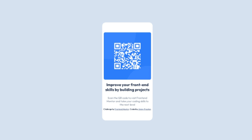
@kudos2Shef
Posted
Hi @MonetCode88,
Congratulations on successfully completing this project! 👍 Your solution is commendable.
Here are some suggestions to further enhance your code:
When it comes to sizing images, it's recommended to utilize object-fit: cover
. Consider adjusting the width from 18em to 16em or 90%. This will fit within the white container. Here's an example:
.inner img {
width: 16em;
object-fit: cover;
}
Please note that the .attribution class
, mentioning 'name' and 'frontend mentor challenge,' isn't a part of the challenge itself. It should be placed outside the .outer div class and positioned at the end of your code.
I observed that you applied margin: none
in .inner img and .inner, rather than specifying it separately for each class. You can simplify this by applying it globally to all elements. Example:
* {
margin: 0;
padding: 0;
box-sizing: border-box;
}
To center the card effectively, consider utilizing flex or grid within the body. Here's a sample approach:
body {
display: flex;
align-items: center;
justify-content: center;
flex-direction: column;
min-height: 100vh;
}
While the project inherently possesses responsiveness, you might notice that the .container class width fluctuates across various dimensions.
Modify the .outer width from width: 100vw to width: 200vh
. This will ensure consistent sizing across all dimensions. The unit 'vw' is usually avoided since 100vw equates to 100% of the viewport width, leading to automatic adjustments based on dimensions.
.outer {
width: 200vh;
}
I hope you find these recommendations valuable. Keep up the fantastic work!
@MonetCode88
Posted
Thanks for the feedback. The image part really was a struggle for me so I appreciate your notes on that part! @kudos2Shef