

Design comparison

Community feedback
- P@Sven-27Posted 4 months ago
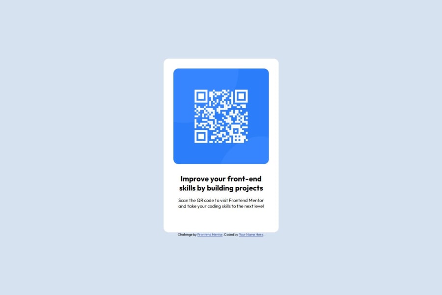
(HTML file). I would put the card-container in a main element. Because that is the important part of the page.
The element with the hook class would be better to store it in a h1 element. Because that is the title. and the cta class i would put in a p element.
That way it is more clear what the purpose is of the elements in your structure. It also makes a big difference for screen readers.
(CSS file). In the new css you can structure the css like you do in the html. Like SASS. That way you can structure your css better.
I would give the body always a min-height incase you have pages that need more room then the 100vh. And to center the card it is shorter to use display grid with place-items: center. For this case anyway.
Other then that it looks good.
0

Please log in to post a comment
Log in with GitHubJoin our Discord community
Join thousands of Frontend Mentor community members taking the challenges, sharing resources, helping each other, and chatting about all things front-end!
Join our Discord