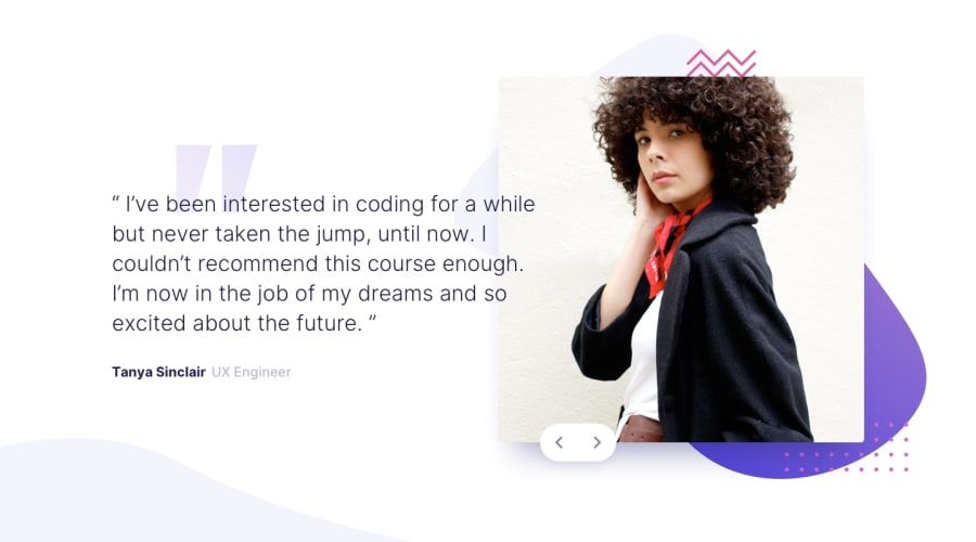
Design comparison
Solution retrospective
I struggled with the shadow behind the image and button - I ended up just putting a smaller shadow around the button. The shadow seems very exact to the left bottom of the image. when I tried my shadow would always bleed into the bottom left or too far right and not enough towards the bottom. Wondering if anyone has any tips or had any luck with this ?
Any feedback is appreciated 😊
Happy Coding ⌨️
Community feedback
- @molszewski34Posted about 3 years ago
My background img "/images/pattern-bg.svg" wasn't in img-container, but in main card so img filled the space. Button is in absolute position with z-index so when img fill the space so the button at the botton giving an effect of being in blur. Try to put background in main and then change img-container.
Marked as helpful0 - @BurritoDoggiePosted about 3 years ago
Hey!
It is very good! I love the button!(I like all cool buttons🤩) I encountered a small problem. I'm on a mobile device and the website did not completely fit my screen. It was not off a lot only a little though. I sorry but I don't know how to fix this☹️☹️☹️☹️. If you look at the 'report' above it might help you.🙃
Keep Coding!
(●♡∀♡)
0
Please log in to post a comment
Log in with GitHubJoin our Discord community
Join thousands of Frontend Mentor community members taking the challenges, sharing resources, helping each other, and chatting about all things front-end!
Join our Discord
