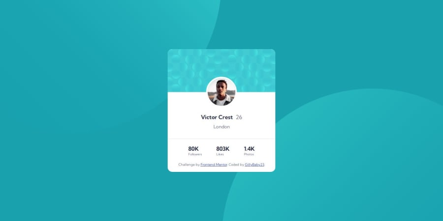
Design comparison
SolutionDesign
Solution retrospective
What are you most proud of, and what would you do differently next time?
I'm new to HTML and CSS so creating a card for now is achievement for me
What challenges did you encounter, and how did you overcome them?As I don't use figma, it's hard to find the correct spacing. Background also quite challenging :)..
What specific areas of your project would you like help with?As I'm new to HTML & CSS any feedback is welcomed. Thanks in advance for your time!
Community feedback
Please log in to post a comment
Log in with GitHubJoin our Discord community
Join thousands of Frontend Mentor community members taking the challenges, sharing resources, helping each other, and chatting about all things front-end!
Join our Discord
