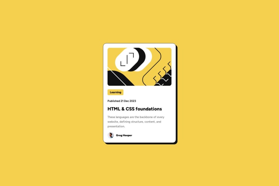
Design comparison
SolutionDesign
Solution retrospective
Any sugestions on structure of my html or css are welcome. I am trying to build up great understanding of basics on small projects so when I go onto something bigger I won't get lost when there will be more then 100 lines of code.
Community feedback
- @solvmanPosted 9 months ago
Very well done project! 🫶 Congratulations! 🎉
- ⭐️ Great use of semantic HTML 🙌
- ⭐️ Global variables 👌
- ⭐️ Use of REM units 👍
- ⭐️ Grid and Flex 💪
I have a couple of tiny suggestions for you:
- ⭐️
<div class="blog-owner">
could be re-done using semantic<figure>
element like so:
<figure class="blog-owner"> <img src="images/image-avatar.webp" alt="avatar"> <figcaption>Greg Hooper</figcaption> </figure>
- ⭐️ There is a
<time>
semantic HTML element. It would be best if you utilize it whenever it is appropriate:
<p class="card__published">Published <time datetime="2024-01-28">28 Jan 2024</time></p>
- ⭐️ There is nothing wrong with using
<h1>
within the card. However, this card-like widget will probably be used with multiple other cards within some bigger content pages. Though multiple<h1>
elements on a page, one per<section>
or<article>
, are within the HTML5 specifications, it is discouraged due to use by assistive technologies. Having a single<h1>
per page is a widely accepted practice. Think ahead about what content/arrangement, whatever you are designing, is going to be placed in. With that said, The<h2>
heading is the most appropriate for the card-like widget. To avoid breaking hierarchy heading rules, I added an invisible<h1>
heading to announce "Frontend mentor project submission" to accessibility users:
<main> <h1 class="sr-only">Frontend Mentor blog card project submission.</h1> <article class="blog-card"> ... <h2>HTML & CSS foundations</h2> ...
Visually hidden class:
.sr-only { position: absolute; width: 1px; height: 1px; padding: 0; margin: -1px; overflow: hidden; clip: rect(0, 0, 0, 0); white-space: nowrap; border: 0; }
Otherwise, quality project submission! 🤩 Attention to detail is stunning. 👏 Pixel perfect! 👌 Keep it up!👏 I hope you find my comments useful 🫶
1
Please log in to post a comment
Log in with GitHubJoin our Discord community
Join thousands of Frontend Mentor community members taking the challenges, sharing resources, helping each other, and chatting about all things front-end!
Join our Discord