Design comparison
SolutionDesign
Solution retrospective
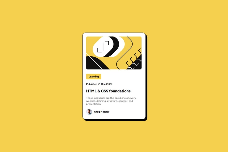
Feedback would be much appreciated. I find it difficult with aligning text with image to be in the same line, I try using display: inline but it's not what I expected (the Greg Hooper part).
Community feedback
- @justinconnellPosted 10 months ago
Hi @p1nu,
Great job on your initial solution submission so far it's looking really great!
Based on reviewing the layout on the preview site it looks like the following still needs to be implemented:
- applying the active states
- making the page mobile responsive
In response to the difficulty you expressed with aligning the author avatar and name, you could just use flexbox to hand the layout for example:
.author {
  display: flex;
  align-items: center;
  column-gap: 10px;
}
I hope you find this feedback useful.
Keep on coding!
Marked as helpful1
Please log in to post a comment
Log in with GitHubJoin our Discord community
Join thousands of Frontend Mentor community members taking the challenges, sharing resources, helping each other, and chatting about all things front-end!
Join our Discord
