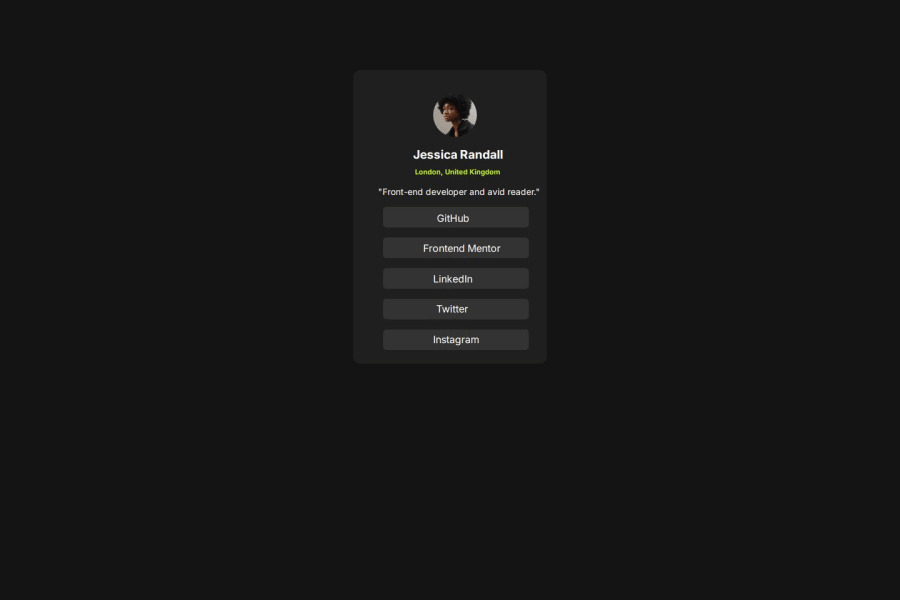


Design comparison

Solution retrospective
Hi, guys ! I am very proud with my project, because this is the first time I ever build something without the help of Youtube. I know that my code is messy and all this rem % and px are not very clear to me, and probably you will find so many mistakes, and discrepencies with the real photo, but overall I can't even describe how happy and proud I am with myself. I will go to buy me an ice cream to reward myself :D Please guys and gals, dismentle me, its only up and forward from where I am, so I can't wait.
What specific areas of your project would you like help with?some easy way to remember and understand how to use css units and also responsive design is not very clear to me yet
Community feedback
- @stewil87Posted 7 months ago
Hey xristevich,
nice that you finished a challenge. We all went once the same way you do now. Sometimes people forget about that :)
General Measurements: I would just recommend a external site for difference about measurements, like this one https://www.freecodecamp.org/news/css-units-when-to-use-each-one/ Maybe just build a test page put some divs and child ones inside another put different background colors on it and experiment with different units described in the article.
social-links-image: In the avatar image part, you tried to center the image with flex, which is overall a great approach, the smallest part you should know in the beginning to make this part, without usage of
padding-leftis howflex-direction: row | columnchanges the wayalign-items/justify-contentwork. Default if you usedisplay:flexisflex-direction: row, even if you don't define it. if this is given and you doalign-items: center, it will center the child vertically (try it by give the parent .social-links-image a height for testing purpose) and when you changeflex-directiontocolumn,align-items: centerwill center the child nodes horizontal.justify-contentwill work vice versa.#container-social-links Instead of every element to have a padding left, you could do a
paddingon the hole container mentioned, and your divs text-number-X could than just have a width of 100% percent, which you'll learn in the above article is seeing relative to its parent.just read through some of your raw css: in your
ptag you tried to usealign-items: center;but this andjustify-contentwill only work, when you use it together withdisplay: flex;EDIT: the block level / inline was not that relevant here
.text-number-X Instead of divs you should use an unordered list
ul >li(list-style: none) the including links a, to have a real list of links to your profiles. Also for identical type of items you can use all the same class. in your solution the only one difference visible is thepadding-left. So dont repeat yourself. you need to learn how to overwrite and extend css. just put the sharing part, all equals into one class like ".text-number" and then add a second value to attribute class like 'github'. the more precise css will overwrite less precise (, or on same level, the later will overwrite the first expression) ex.://HTML <div class="text-number github">bla</div> <div class="text-number frontend-mentor">bla</div> <div class="text-number linkedin">bla</div> //CSS .text-number { all the stuff, which is always the same } .text-number.github { padding-left: 10px; } .text-number.frontend-mentor { padding-left: 5px; }best regards
0@xristevichPosted 7 months ago@stewil87 Woww Stefan thank you so much for your feedback. It will take me a while to digest the all information you just give me but I will 100% ! I have never been more excited to learn and practice and…make mistakes and people like you and the all community here at Front End Mentor are making the all learning path more meaningful and fun. Thank you one more time !
1@xristevichPosted 7 months ago@stewil87 Hi, Stefan ! I hope I am not bothering you. I tried to implement most of the information you gave me the last time and I was wondering if you can check out my new social-links-thingy (https://github.com/xristevich/social-links-card2). I know I still haven't mastered the units and other then that can you please give me your critics and feedback. Thank you for your time and one more time I apologise if I am bothering you !
0@stewil87Posted 7 months ago@xristevich Hey, sry for delay. Overall this is a much better solution, than before. Great!
The image is not shown, because the directory given connects to a folder which is not in the project, but will only exist on your computer ;)
In the container-image you could write
display: flexwithoutflex-direction: column, instead writingjustify-content: centerto have one line less of code, because its works vice versa to align-items. but it might be just my personal preference.this ul list is great now, that looks fine. But now you repeat yourself over and over from css line 72 to end. css is strong, when you overwrite styles. in the class attribute of on the li's you can add multiple classes just put space between them. You will need overwriting styles at very many cases (take a look into https://css-tricks.com/specifics-on-css-specificity/).
if you want the the button (the backgrounded li) to be clickable, not just the text, you need to change the behavior of the a tag. its standard is display inline, change it to display: block and put 100% width and height on it.
Approach for overwriting and extend css rules Look in the first html/css comment so you could replace the css in the manner of the first comment with:
<ul class="ul-items">
     <li class="text-number GitHub"><a href="https://github.com/">GitHub</a></li>
     <li class="text-number Frontend-Mentor"><a href="https://www.frontendmentor.io/">Frontend Mentor</a></li>
     <li class="text-number LinkedIn"><a href="https://www.linkedin.com/">LinkedIn</a></li>
     <li class="text-number Twitter"><a href="https://x.com/">Twitter</a></li>
     <li class="text-number Instagram"><a href="https://www.instagram.com/">Instagram</a></li>
     </ul>

//CSS from line 72 to end replacement
.text-number{
   width: 80%;
   height: 25px;
   border: 5px;
   border-radius: 4px;
   background-color: #333333;
   font-size: 10px;
   text-align: center;
   padding-top: 2.5%;
}

.text-number a{
   text-decoration: none;
   color: #ffffff;
}

.text-number.Frontend-Mentor,
.text-number.LinkedIn,
.text-number.Twitter,
.text-number.Instagram {
   margin-top: 3%;
}
0

Please log in to post a comment
Log in with GitHub
Join our Discord community
Join thousands of Frontend Mentor community members taking the challenges, sharing resources, helping each other, and chatting about all things front-end!
Join our Discord