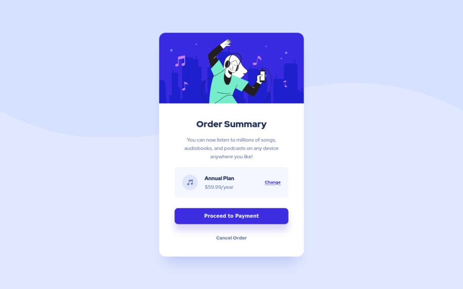
Design comparison
SolutionDesign
Community feedback
- @grace-snowPosted almost 3 years ago
Hi
Looks good except content in thme annual plan box is overflowing off the side of the screen on mobile - don't forget to shrink viewport down for smaller phones, there are a lot out there around 320 wide (some new Samsungs even go down to 280)
Here are some suggestions, I hope they help
- please please please Indent your html consistently. It's really hard to read and will become harder to find issues as you do larger projects
- remove the div with the bg image on. Instead put that image on the body. Don't clutter the html or position absolute items that you don't need to
- line height should be unitless like 1.5
- font size should never be in px. Use rem
- you're changing font weight a lot. That shouldn't be necessary - base styles at the start can set font weight on body and heading elements
- should annual plan be a heading? I think so
- the cause of overflow in the price box is because of the way you're using large margins. That shouldn't be necessary. You can use grid or flexbox to lay that out and create gaps with the gap property. Choose what you want to happen as space becomes limited with either minmax column widths with grid or flex grow shrink and basis properties with flexbox (eg when space becomes too limited the change button could drop down a line or the icon could shrink)
- think about what elements to use for interactivity. This is an important principle - Anchor tags for navigation, buttons for action. Why is proceed a button here? Why are change and cancel anchor tags? What do you expect to happen with each. Might be fine, or might not, all depends on what you would expect to happen on click
- for those interactive elements I think you can use more reusable class names. Eg you could have a standard
.linkstyle, then a class to modify the color like.link--muted. Same with button styles, it's more usual to have generic styles for elements like that throughout a site than component specific ones - you shouldn't need loads in a media query on this challenge. From glancing at the designs, all I notice is increased padding in the card on desktop. I'd remove everything in the huge screen media query on this and instead have one mq that increases padding as soon as there is room for that to happen.
Good luck
Marked as helpful4
Please log in to post a comment
Log in with GitHubJoin our Discord community
Join thousands of Frontend Mentor community members taking the challenges, sharing resources, helping each other, and chatting about all things front-end!
Join our Discord
