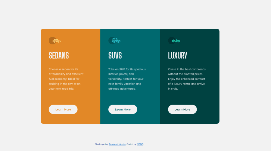
Design comparison
SolutionDesign
Solution retrospective
Another Newbie project completed Tried flexbox for the first time, though not that much used it in this. If any suggestions pls ping me up, will help me improve. Thnks:)
Community feedback
- @deepak-parmarPosted over 2 years ago
@XENO2410, Nice work on the challenge!
- You're yet to implement active state for "Learn More" buttons, it should have transparent background and border when hovered on.
You need to use some semantic HTML tags to improve accessibility of the component...
- Wrap the essential elements of the page using the landmark tag
<main> - Sedans, Suvs, etc. are header to its respective section so they need to be treated as header using
h1-h6tags. - Use appropriate tag to wrap text, and use
divjust as container. - the
Creditselement serves as the footer of the webpage, in this case you can wrap that element intofootertag.
One of the best resource to research all this is the MDN Docs. I hope these tip helps. Keep coding 🤘
Marked as helpful0@XENO2410Posted over 2 years ago@deepak-parmar Thnks for the suggestions, will implement it🙂
0
Please log in to post a comment
Log in with GitHubJoin our Discord community
Join thousands of Frontend Mentor community members taking the challenges, sharing resources, helping each other, and chatting about all things front-end!
Join our Discord
