Design comparison
Solution retrospective
I think I am getting the hang of it =)
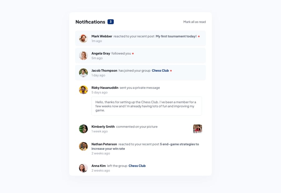
I just couldn't figure out how to adjust the last 3 notifications as the rest of the layout. Its a little bit funky. Can someone please help me see what is wrong?
Community feedback
- @joangutePosted over 2 years ago
Hi Bernardo, it seems not all of the 3 last notifications have that problem, it is just the Kimberly Smith notification.
You have the size of your
imgtags relative to the container width(max-width:50%), but since that specific notification has three elements, it gives thedivwith class="image" less space than the other ones and so the img tag is smaller and looks like is more to the left.You can set up a specific max-width as 40px or any size you want and add to your 'image' class a "padding: 0 1rem". Then you can change your align-items and your justifify-content to improve the result. That will fix the problem.
Marked as helpful1@BernardoHollmannPosted over 2 years ago@joangute Thanks, friend! That worked perfectly!
0
Please log in to post a comment
Log in with GitHubJoin our Discord community
Join thousands of Frontend Mentor community members taking the challenges, sharing resources, helping each other, and chatting about all things front-end!
Join our Discord
