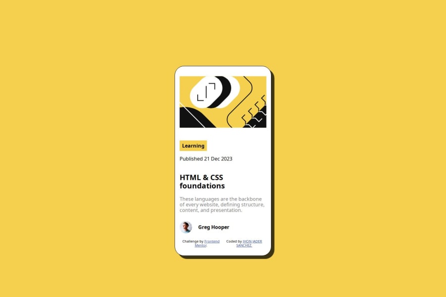


Design comparison

Community feedback
- @boysersPosted 9 months ago
Hi, a tip: never put all your CSS in media queries. This practice limits the readability and maintainability of your code. "Media queries" are intended to adjust styles based on different devices and screen resolutions. By isolating all your CSS within them, you make it harder to manage the overall site styles.
And (in index.html) replace svg to img.
<img src="./assets//images/illustration-article.svg" alt="illustration article" >I corrected your CSS to show you the difference. Feel free to use it as a reference or for inspiration.
@import url("https://fonts.googleapis.com/css2?family=Figtree:ital,wght@0,300..900;1,300..900&display=swap");

html {
  font-size: 62.5%;
  box-sizing: border-box;
}
*,
* ::before *,
*::after {
  box-sizing: inherit;
}
:root {
  --Yellow: hsl(47, 88%, 63%);
  --White: hsl(0, 0%, 100%);
  --Grey: hsl(0, 0%, 50%);
  --fuente-principal: "Figtree";
}

/* CSS custom properties */

body {
  box-sizing: 16px;
  font-family: var(--fuente-principal);
  background-color: var(--ight-gray);
  font-size: 16px;
}

.contenedor {
  background-color: var(--Yellow);
  display: flex;
  justify-content: center;
  align-items: center;
  padding: 0 2rem;
  height: 100dvh;
}

.contenedor__car {
  max-width: calc(384px - 1.5rem);
  -webkit-box-shadow: 10px 10px 1px 0px rgba(0, 0, 0, 0.75);
  -moz-box-shadow: 10px 10px 1px 0px rgba(0, 0, 0, 0.75);
  box-shadow: 10px 10px 1px 0px rgba(0, 0, 0, 0.75);
  background-color: var(--White);
  padding: 1.5rem;
  border: solid 1px black;

  border-radius: 3rem;

  display: flex;
  flex-direction: column;
}

.contenedor__header {
  max-width: 100%;
}

.contenedor__header img {
  width: 100%;
  height: 200px;
  object-fit: cover;
  border-radius: 2rem;
  display: block;
}

.contenedor__navegacion {
  margin-top: 2rem;
  font-weight: 400;
}

.contenedor__btn input {
  background-color: var(--Yellow);
  border: none;
  padding: 8px;
  font-weight: 800;
  border-radius: 4px;
}

.contenedor__text h2 {
  margin-top: 0;
  font-weight: 800;
}

.contenedor__text p {
  color: var(--Grey);
}

.contenedor__img {
  display: flex;
  align-items: center;
  gap: 12px;
}

.contenedor__img p {
  margin: 0;
  margin-right: 2rem;
  font-weight: 800;
}

.contenedor__img img {
  width: 4rem;
  height: 4rem;
}

.contenedor__footer {
  display: flex;
  justify-content: center;
}

.attribution {
  font-size: 11px;
  text-align: center;
}

.attribution a {
  color: hsl(228, 45%, 44%);
}

@media (max-width: 768px) {
  .contenedor__btn > input,
  p {
    font-size: 12px;
  }

  .contenedor__text > h2 {
    font-size: 20px;
  }

  .contenedor__text > p {
    font-size: 14px;
  }
}
Good luck! 😉
Marked as helpful0 - @JJSanchez33Posted 9 months ago
Hola, ¿Cómo estás? Espero que te encuentres bien. Gracias por el aporte, me fue muy útil. La verdad es que sí me di cuenta de que encerrar mi código al iniciar en puros MQ me complicaba a la hora de utilizar varios tamaños de pantalla; tenía esa gran duda. Y estoy de acuerdo contigo, es una mala práctica hacerlo. Gracias por el aporte.
1

Please log in to post a comment
Log in with GitHub
Join our Discord community
Join thousands of Frontend Mentor community members taking the challenges, sharing resources, helping each other, and chatting about all things front-end!
Join our Discord