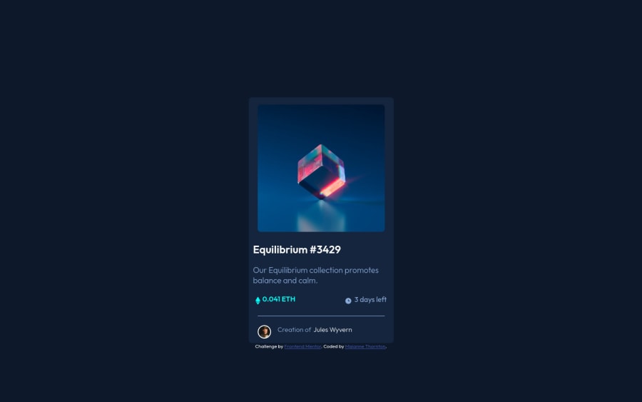
HTML CSS NFT Preview Card Component
Design comparison
Solution retrospective
This is my first challenge, and I found the challenge very engaging and fun!
Special shoutout to @PhoenixDev22 and @zeerobit for their helpful comments π
Any suggestions on my code would be greatly appreciated. Thank you!
Community feedback
- @zeerobitPosted almost 3 years ago
Congrats on completing your first challenge and for being your first you've done well however there are still some things that need improvements:
- use class instead of id for styling , also I noticed you have ethClock as class and ID which is not practical and can cause issues. I suggest to read up on BEM which will help you write better class names. Here is an article you can check out https://9elements.com/bem-cheat-sheet/
- If there are multiple parts on a project that needs to be styled similarly you can always have a secondary class name so you can use that one class name to target them all at once, example: class="price icon" class="clock icon" ("icon" is the secondary class name)
- you don't necessarily have to target the eye image separately in order to position it in the middle, simply make the .overlay class flex then with justify-content/align-items: center you can position the eye image in the middle.
- switch the background-color for the overlay from hsl to rgb then add the opacity value to it so you can manipulate the transparency of the overlay color itself without affecting the opacity of the eye image , it would look something like this background-color: rgb(0, 255, 247, 0.4); then set the opacity to 1 for the overlay hovering instead of 0.5 so the eye image retains its full opacity
- use rem instead of px, especially for stuff like width, font-size, padding, margin since px is not scalable
Hope this feedback helps, Happy coding !!!
Marked as helpful0@MaianneThorntonPosted almost 3 years ago@zeerobit Thank you so much for your advice and assistance in condensing my code! Your advice was quite helpful! In the "Acknowledgements Section" of my readme file, I included a special shoutout to you. Thank you once more; without you, I would not have been able to address the issues in my report!
1 - @PhoenixDev22Posted almost 3 years ago
Greeting MaianneThornton, Congratulation on completing your First Frontend mentor project, your solution looks nice. I think you have done a great work for your first challenge. To tackle the issues shown in your Report, I would suggest to: β’ Wrap everything in your body in <main> ... OR use semantic tags ... OR give role="" to the direct children of your <body> ... Click here to read more.
β’ Have at least one <h1> in your code.(https://dequeuniversity.com/rules/axe/4.3/page-has-heading-one?application=axeAPI). You can replace the <h3> by <h1>.
Also, you should have wraped "Equilibrium #3429"in an anchor tag <a></a>. (You need an interactive element around them. Anything with a hover style in a design means itβs interactive)
β’ You can add this code
display: flex; align-items: center; justify-content: center; width: 100%; height: 100vh flex-direction: column;
to the <body> to center the#card
and the attribution .β’ You can add
border-top
to<div id="creation">
instead of using<hr>
.β’ You can alt text for the images that are the icons in
class="icon"
andclass="eye"
to an empty string. That's because the purpose of those images are mostly decorative and need not be announced by assistive technology like screen readers.Perhaps looking into the BEM methodology to better name and organize your classes. read more about BEM. Don't stop and keep doing solutions, hope this feedback helps. Happy coding
Marked as helpful0@MaianneThorntonPosted almost 3 years ago@PhoenixDev22 Thank you so much for your advice and assistance in condensing my code! Your advice was quite helpful! In the "Acknowledgements Section" of my readme file, I included a special shoutout to you. Thank you once more; without you, I would not have been able to address the issues in my report!
0
Please log in to post a comment
Log in with GitHubJoin our Discord community
Join thousands of Frontend Mentor community members taking the challenges, sharing resources, helping each other, and chatting about all things front-end!
Join our Discord