Design comparison
SolutionDesign
Solution retrospective
any tips are apprecited
Community feedback
- @remtainePosted over 2 years ago
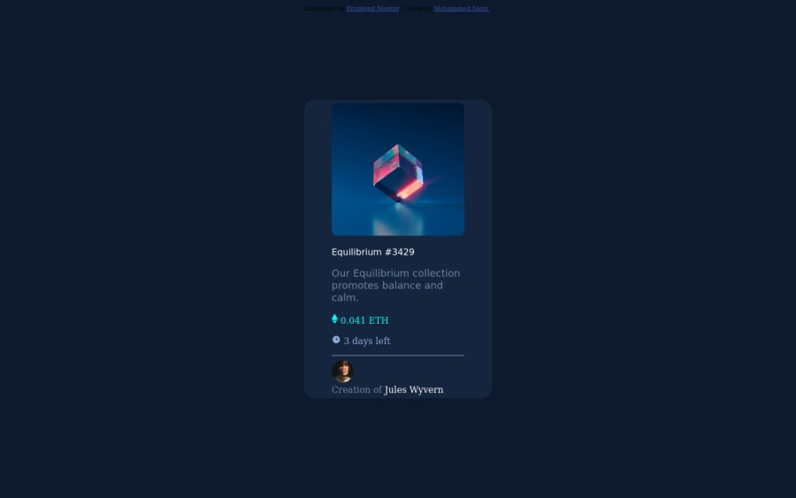
It looks more or less okay at first glance. For things to fix, make the cyan overlay the same size as the image, which could be done by having them in the same div and making them take the full length and width. More spacing would be beneficial for readability. Also make sure to not wrap the rows containing the ETH and days left, as well as the profile image so it'll be similar to the design. I suggest you look at the style guide as well so you know what fonts to use.
Marked as helpful0
Please log in to post a comment
Log in with GitHubJoin our Discord community
Join thousands of Frontend Mentor community members taking the challenges, sharing resources, helping each other, and chatting about all things front-end!
Join our Discord
