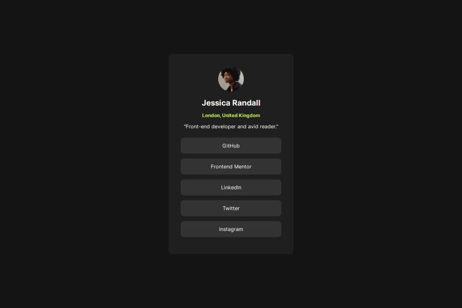
Design comparison
Solution retrospective
what i am proud in, is how to deal with flex
What challenges did you encounter, and how did you overcome them?how to center divs
What specific areas of your project would you like help with?i want to make the code less
Community feedback
- @appsbygitaPosted 10 months ago
Overall, it looks good. There's just a small discrepancy with the design. The space between name and location should be smaller than the space between location and the line after it.
1 - P@danielmrz-devPosted 10 months ago
Hello there!
Congrats on completing the challenge! ✅
Your solution looks great!
📌 It's recommended to use semantic HTML elements like
<ul>and<li>for creating lists. This ensures that your code is more accessible, maintainable, and semantically meaningful.Here's and example on how you can refactor your code:
After Refactoring
<ul class="list-container">
    <li><a href="#">Github</a></li>
    <li><a href="#">Frontend Mentor</a></li>
    <li><a href="#">LinkedIn</a></li>
    ...
</ul>
By using
<ul>and<li>, you convey the structure of your content more clearly, making it easier for screen readers and search engines to understand. Additionally, it aligns with best practices for HTML semantics.I hope you find this helpful!
Keep up the excellent work!
0
Please log in to post a comment
Log in with GitHubJoin our Discord community
Join thousands of Frontend Mentor community members taking the challenges, sharing resources, helping each other, and chatting about all things front-end!
Join our Discord
