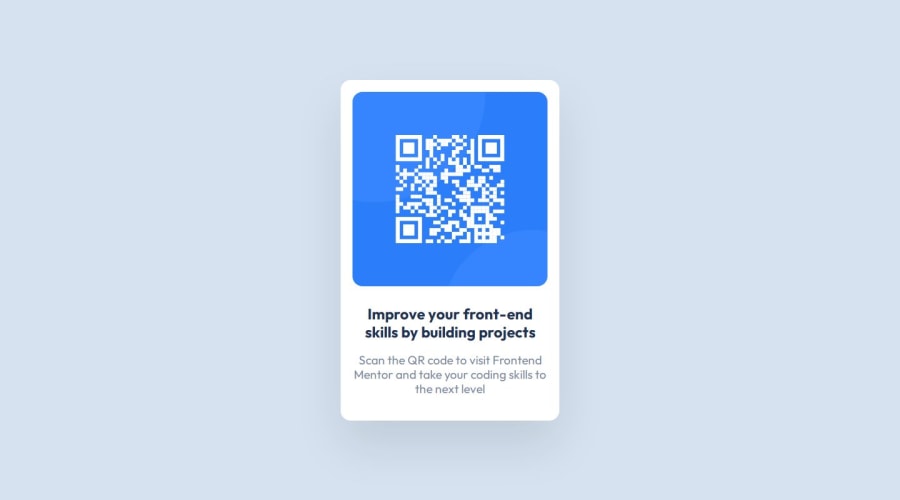
Design comparison
Solution retrospective
It's my first submission to FEM, and I have a little more than 3 weeks of practice. Everything was a challenge, and it took me 1.5 hours to get it together. I'm super happy at the moment!
What challenges did you encounter, and how did you overcome them?My current experience is based on a few online tutorials, so I was uncertain about how to start. I decided to write the whole HTML first, reset the margin and padding to default, and move from there. My ultimate decision was to make it a big flexbox container with the flex-direction set to column.
What specific areas of your project would you like help with?I'm completely open to feedback. I know the solution is visually close to what it should be, but I would love to have some feedback on the code itself for best practices.
Community feedback
- @MihaiChirilovPosted about 1 year ago
I have also used the @import option to import the font in the .css file. @import url('https://fonts.googleapis.com/css2?family=Outfit:wght@100..900&display=swap');
It is less code to write and it makes sense to have the font import inside the global .css file. If you would like to use the same font on different html pages, you would have to import them on each page.
Marked as helpful1@DanCodeCraftPosted about 1 year ago@MihaiChirilov I'm totally not familiarized with the @import option! I will check it out. Thanks a lot!
1 - @MihaiChirilovPosted about 1 year ago
Hi Adann, congrats for an excellent job! It is a simple project but you did really well. I would suggest removing this line from your css file: max-width: 1440px; It affects the body tag from your index.html file. And the result is that on larger screens (I have a width of 5120px on my desktop) your QR card component is not horizontally aligned. Only after I resize the browser window to 1440px or less, the card looks centred horizontally. Thank you
Marked as helpful1@DanCodeCraftPosted about 1 year ago@MihaiChirilov Hey, thank you for the feedback! I will fix that right now - and I'm positively jealous of your screen size lol
1 - @Alvaro-NeyraPosted about 1 year ago
It doesn't have a main section and a role landmark. All of the rest is good and well implemented. The code is well-structured and readable. Nice project!
1@DanCodeCraftPosted about 1 year ago@Alvaro-Neyra thank you for the feedback! You're right. I just fixed it all!
1
Please log in to post a comment
Log in with GitHubJoin our Discord community
Join thousands of Frontend Mentor community members taking the challenges, sharing resources, helping each other, and chatting about all things front-end!
Join our Discord
