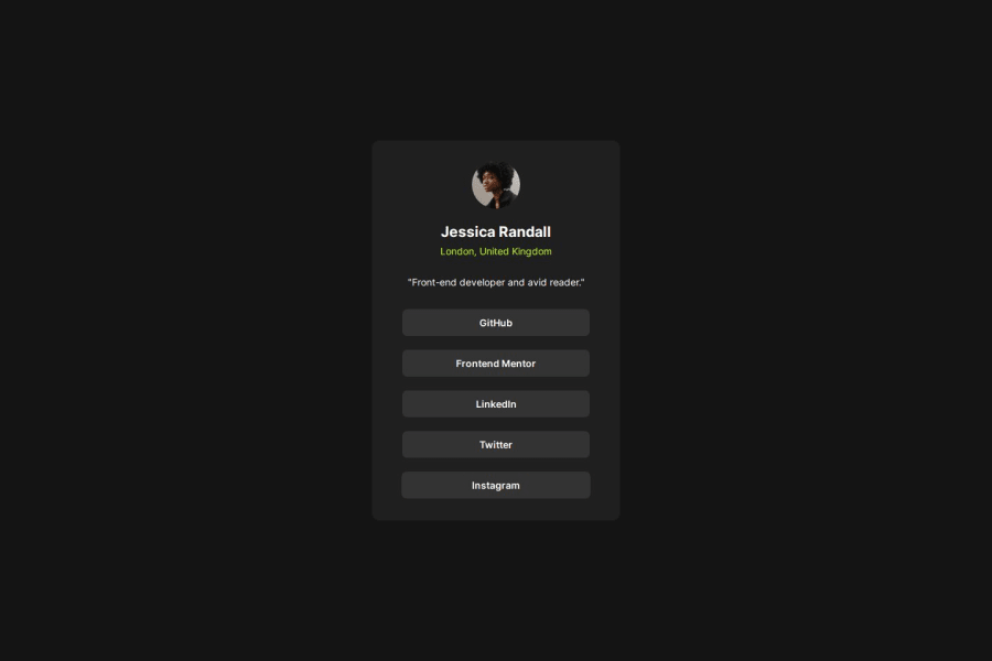
Design comparison
Solution retrospective
Getting to understand how Max-width and Min-width response with various screen size display
What challenges did you encounter, and how did you overcome them?-
I was confuse about how Max-width and Min-width works, which size screen to be used on and to scale them. search for solution online (https://www.youtube.com/watch?v=6UXn3U1dXH0&pp=ygUibWluLXdpZHRoIHZzIG1heC13aWR0aCBtZWRpYSBxdWVyeQ%3D%3D) (http://stackoverflow.com/questions/16647380/ddg#24640497)
-
how to center the cards. Thanks to @Carmenyo on Frontend Mentor for helping out with the source code to help center the cards
I used anchor tag for the links, cause i thought i will work better over buttons
Community feedback
- @The-BoxHead-GuyPosted 8 months ago
Nice try at this one bro! it seems incredible, and the code it's also clean.
I noticed that you stylized the "location" text without being bold, I found that a 600
font-weightwould seem delightful to it once applied!Greetings!
0
Please log in to post a comment
Log in with GitHubJoin our Discord community
Join thousands of Frontend Mentor community members taking the challenges, sharing resources, helping each other, and chatting about all things front-end!
Join our Discord
