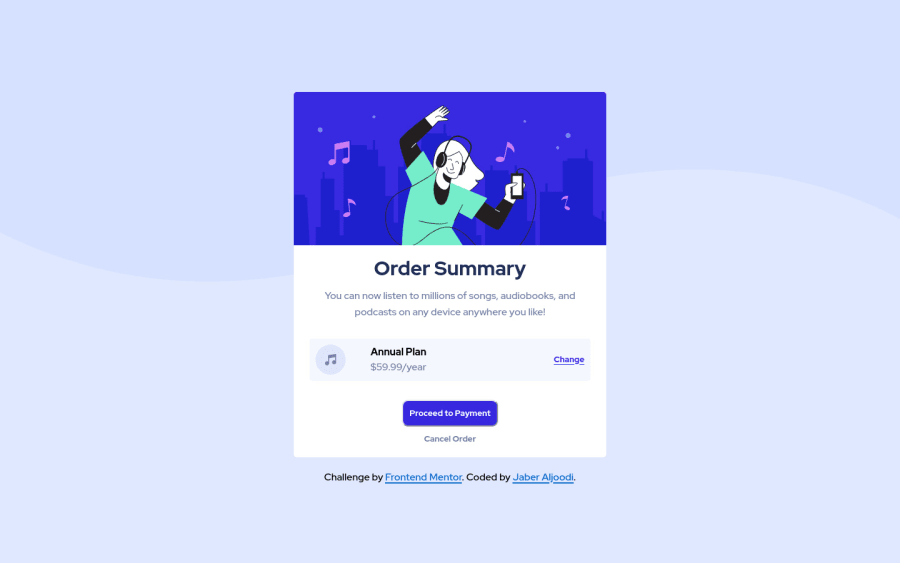
Design comparison
Community feedback
- @JesseOlisaPosted over 2 years ago
Hello @jaaljoodi,
Well done on completing this challenge. I went through your code and I must say it is neatly written and very easy to go through. Keep it up.
However, I will like to point out the code repetition regarding your button element. A class of "btn" was created in your CSS file but you didn't assign it to any button element in your html. This could have saved you from re-writing properties such as border, border-radius and others which are similar across the buttons.
So assign the "btn" class to your buttons and only add the necessary codes to your primary and secondary buttons.
Also, you can use the min-width property to stretch your primary button across your container.
Again, Well done and keep it.
Marked as helpful1
Please log in to post a comment
Log in with GitHubJoin our Discord community
Join thousands of Frontend Mentor community members taking the challenges, sharing resources, helping each other, and chatting about all things front-end!
Join our Discord
