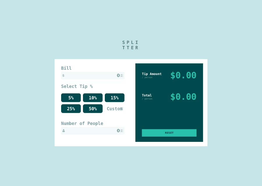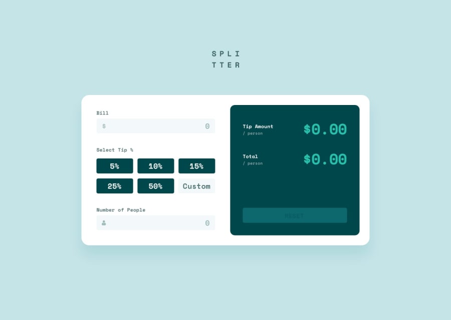
Design comparison
Solution retrospective
Hi again! My next project's here. I am still getting better and better in js and CSS. What thing I've noticed is that when I zoom my website I don't have scrolls to move up or left. Kind of the certain part of site's just disappearing. What can I do with it? I have no idea. Thanks in advance
Community feedback
- @Oluwafemi21Posted over 2 years ago
If you're looking for scrolls, it's either you have an overflow hidden or you set the height of the body to 100vh which is fixed. solution to the problem: change the height to min-height and set it 100vh. Your mobile view needs to be stacked on each other, if you're using flex for the calculator change the flex direction to column on the 375px media query. Also make sure the calculator doesn't show infinity when there is an error. Good job so far!.
Marked as helpful0@St4niuuPosted over 2 years ago@Oluwafemi21I haven't used overflow: hidden, moreover, I had overflow: scroll in the code. About this min-height: 100vh - on this project it doesn't work, if I set this property the top half moves up beyond the screen and I still can't scroll. I am gonna use it in my next project. The mobile view is made in a hurry - it was the first time I even used media queries. Thanks for the tips! I am thankful.
1@Oluwafemi21Posted over 2 years ago@St4niuu Glad I could help. I will follow you now so we can connect and maybe work on a project together wys?
0
Please log in to post a comment
Log in with GitHubJoin our Discord community
Join thousands of Frontend Mentor community members taking the challenges, sharing resources, helping each other, and chatting about all things front-end!
Join our Discord
