Design comparison
SolutionDesign
Solution retrospective
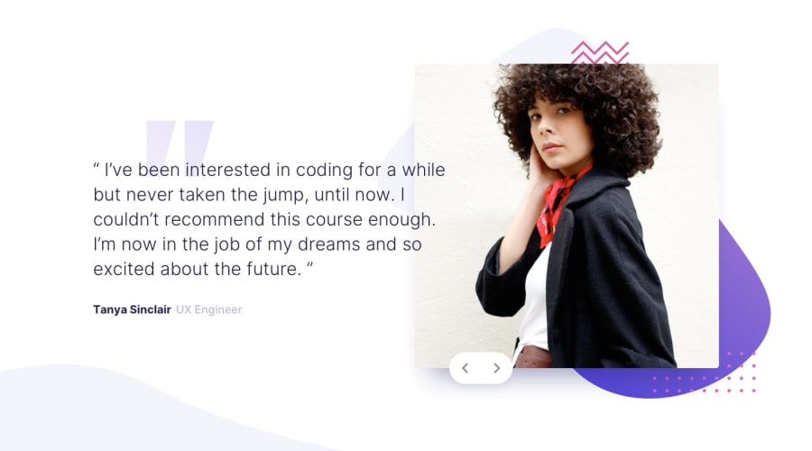
The mobile design is a bit off. I wasn't able to position the buttons correctly on the image, and the slide takes up a bit too much space. Any comments / help is appreciated!
Community feedback
Please log in to post a comment
Log in with GitHubJoin our Discord community
Join thousands of Frontend Mentor community members taking the challenges, sharing resources, helping each other, and chatting about all things front-end!
Join our Discord
