Design comparison
SolutionDesign
Solution retrospective
What are you most proud of, and what would you do differently next time?
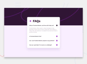
I'm glad I was able to figure out how to do the background image only covering a portion of the page with the content over the top.
If I had more time I would figure out how to use web components or some reusable template for the question answer parts so I don't have to repeat the html.
What challenges did you encounter, and how did you overcome them?the background image and bottom half was tricky to implement. I ended up using flexbox and had to set the height to 100vh so that the bottom half of the background would expand.
also the question answer part was repeated html which should be cleaned up.
Community feedback
Please log in to post a comment
Log in with GitHubJoin our Discord community
Join thousands of Frontend Mentor community members taking the challenges, sharing resources, helping each other, and chatting about all things front-end!
Join our Discord
