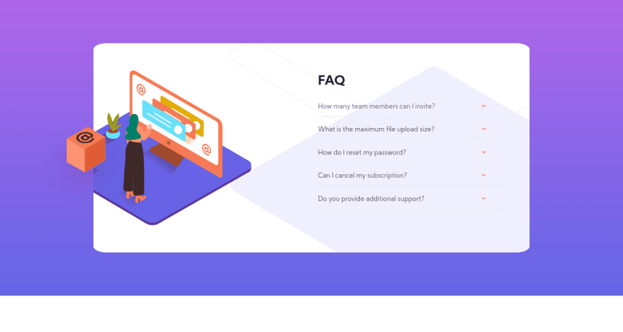
Design comparison
Solution retrospective
Any comment would be appreciate!!
Community feedback
- @ArshKarpoorPosted almost 4 years ago
Hi Thann 👋,
I have some suggestions for you !
-
You could make the height of the card bigger because the illustration is not looking good on tabs
-
You could make background to cover the size of screen
1 -
- @mesutcifciPosted almost 4 years ago
Hey Thanh, Congrats!
I have some advices to you:
-Could you check bg-pattern-desktop is too big than original design
-I realize when i click arrow the illustrations also moved maybe you can prevent this
-When i shrink screen, question section overlap on illustraions maybe you can check responsive design again(for see overlaping you can look 1010px wide)
-on mobile design maybe you can change border-radius
1@lttn-16Posted almost 4 years ago@mesutcifci hi, i really don't know how i can fixed the bg-pattern-desktop with the illustrations together when shrink screen. Could you give me some suggestions? Thanks
0@mesutcifciPosted almost 4 years ago@lttn-16 When I looked again I saw that there is no need to actually reduce the size. You should just reposition your background image.
background-position: -20% 50%, right 500px bottom -200px;İf you add code that above you will see this line of code works but not best solution because if you shrink screen the bg-pattern moves. For prevent this you can create 'img' element and you set position property to absolute. And you can configure with top, left, bottom and right properties.
I had finished this project before. But i realized now my background pattern moving when i shrink window. I will refactor my project but i don't know when i do :). If i do i will let you know.
I'm sorry for not helping much.
0
Please log in to post a comment
Log in with GitHubJoin our Discord community
Join thousands of Frontend Mentor community members taking the challenges, sharing resources, helping each other, and chatting about all things front-end!
Join our Discord
