

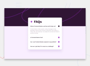
Design comparison

Solution retrospective
Dear All,
Here is my next challenge, another faq accordion. I found mobile first much more convenient, it hardly needs any media queries which is great. However, my biggest issue was the background image. I reall wanted the desktop background image to not shrink with the screen size, but I just wasn't able to do that. Could anyone help me out with that?
Cheers to you all,
Dalma
Community feedback
- P@DeanogitPosted over 1 year ago
Hi @bdal90
Great job completing this challenge
I took a look at your code in chrome dev tools and experimented with the background-image.
I found by removing the
background-size: contain;
&
background-position: 0 3rem;
on the
@media (min-width: 375px) body {}class,the background no longer shrinks in height when the screen width is wider than 375px.
I hope this helps
0@bdal90Posted over 1 year agoHi Dean,
Thanks a lot for checking it out! Yes, you are right, however, if you check the full screen size, you'll notice that the image is not wide enough to cover the whole viewport width (that's why I opted for the background-size: contain solution, but then it produces this weird effect I've just explained).... :/
0P@DeanogitPosted over 1 year agoHi @bdal90,
Ah ok, I haven't tested it wider than 1440px, how wide are you going?
0@bdal90Posted over 1 year agoHi Dean,
Ummm, no idea. :D It's a regular laptop size, nothing special, but if I do it the way you suggested, it leaves a little margin on both sides.... :/
0P@DeanogitPosted over 1 year ago@bdal90 it might be something to do with the svg being rendered as a background-image, perhaps if it is used as a <svg></svg> instead, it will continue to scale to how ever big you'd like it to be, but that will require changing a few things with the layout... docs
0

Please log in to post a comment
Log in with GitHub
Join our Discord community
Join thousands of Frontend Mentor community members taking the challenges, sharing resources, helping each other, and chatting about all things front-end!
Join our Discord