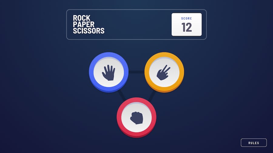
Design comparison
SolutionDesign
Community feedback
- @fadialjawhary0Posted 12 months ago
Looks great, and the animations nice.
Just a quick note, make the button "PLAY AGAIN" cursor pointer. And make it on hover to change the color of the button's text from dark to red. And put some space between the result and the button :).
Great job.
0
Please log in to post a comment
Log in with GitHubJoin our Discord community
Join thousands of Frontend Mentor community members taking the challenges, sharing resources, helping each other, and chatting about all things front-end!
Join our Discord
