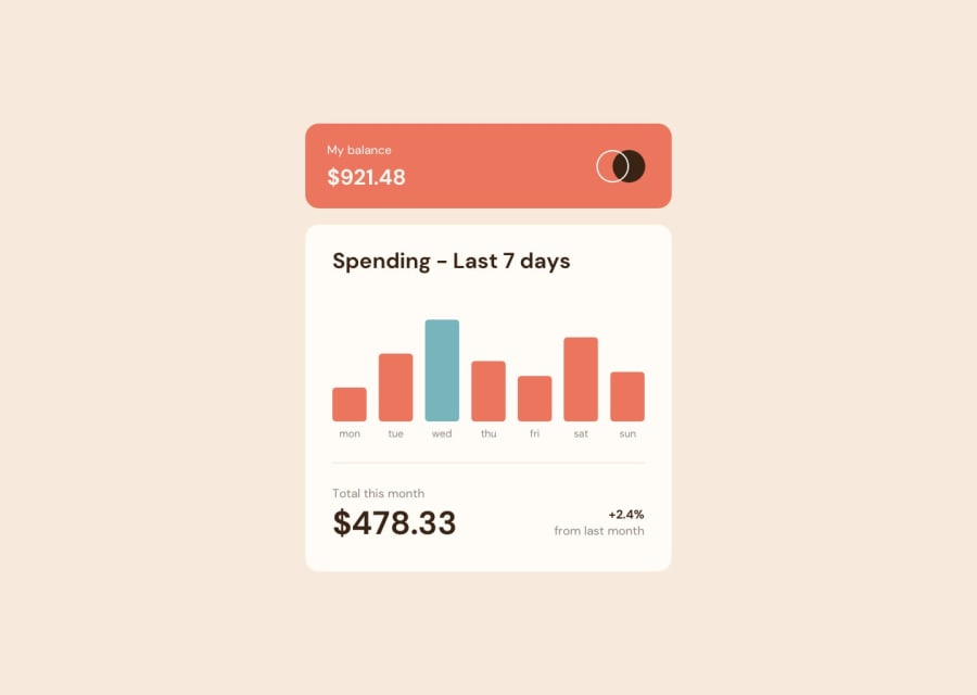
Design comparison
SolutionDesign
Community feedback
- @polukarpPosted about 2 years ago
Overall great solution, but I'd recommend you use <h1></h1> element to underline the main heading of your component so that it's easier for people with visual impairment to navigate your website/component. And also try to erase your comment because HTML validation says "The document is not mappable to XML 1.0 due to two consecutive hyphens in a comment."
0
Please log in to post a comment
Log in with GitHubJoin our Discord community
Join thousands of Frontend Mentor community members taking the challenges, sharing resources, helping each other, and chatting about all things front-end!
Join our Discord
