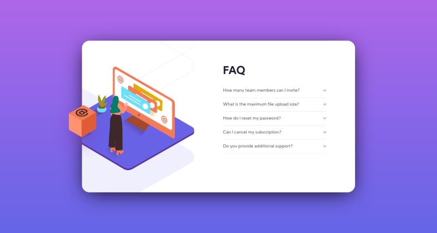
HTML, CSS, JS - FAQ accordion card solution
Design comparison
Solution retrospective
I would like your feedback!
Thanks!
Community feedback
- @pikapikamartPosted almost 4 years ago
Spot on really, it is good looking at both desktop and mobile version^^.
Just to add interaction, and I like that smooth transition in the accordion. Try adding a
cursor: pointerso that it adds another interactive state. But still it is really good and I think this is the best one I seen so far1@lucasdemouramacedoPosted almost 4 years ago@pikamart Thank you very much for the comment and the compliment. I made the mobile, but it seems that here only adds the screenshot of the desktop, and thank you very much for the tip of the cursor, I will add!
0@pikapikamartPosted almost 4 years ago@lucasdemouramacedo yep when submitted it just takes the preview of the desktop and hey don't forget to commit your update so that we could see it as well^
0@lucasdemouramacedoPosted almost 4 years ago@pikamart I updated the cursor, you can already see :)
1@pikapikamartPosted almost 4 years ago@lucasdemouramacedo I can confirm, by far yours is the best that i've seen in this challenge^^^
0@lucasdemouramacedoPosted almost 4 years ago@pikamart Thank you very much, it encourages me a lot :)
1 - @Karimsamir112Posted almost 4 years ago
this is very very good , I like it .I have one suggestion: -You can put cursor :pointeron the arrows to be more beautiful
happy coding and keep going 👍👏
1@lucasdemouramacedoPosted almost 4 years ago@Karimsamir112 Thank you very much for the comment and the tip, I will do it!
0
Please log in to post a comment
Log in with GitHubJoin our Discord community
Join thousands of Frontend Mentor community members taking the challenges, sharing resources, helping each other, and chatting about all things front-end!
Join our Discord
