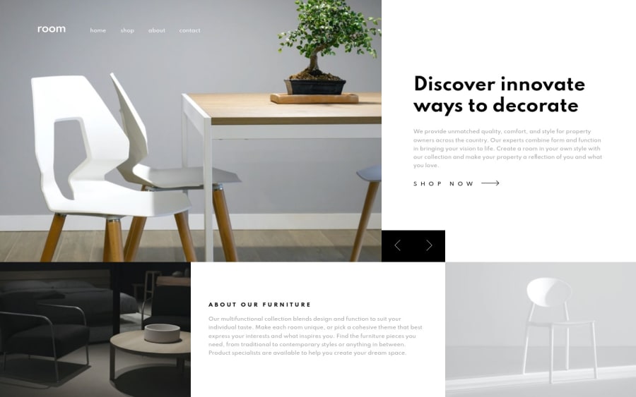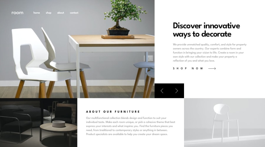
Design comparison
Solution retrospective
Any feedback is very welcome and appreciated. : )
Based on feedback I've been getting I added more than one breakpoint to make the design better accommodate smaller screens and tablets. Added a slide down animation to the mobile navigation menu.
The slide forward and backward buttons were in different grid cells in mobile and desktop. So I put two button groups in the html and they’re toggled on and off when switching between mobile and desktop. This doesn’t feel like the most elegant solution. Would be curious what others think of this approach and if you would recommend a different approach? Thank you!
Community feedback
- @ApplePieGiraffePosted almost 4 years ago
Hey, there, Tyler Gumb! 👋
Nice to see you complete another challenge! Nice job on this one! 👍
Your solution looks good, scales up/down nicely (kudos for that—it's something many people have a little trouble with in this challenge), and the slider works well! 👏
I think you can just use one set of slider buttons for this challenge by making them children of, say, the slider images section, and then using absolute positioning to position them differently in the desktop and mobile layouts of the site. You'll just need to position the buttons to the outside of the slider images section in the desktop layout and on the inside of the slider images section in the mobile layout (both times, near the bottom right of the section), which you can easily do with absolute positioning. 😉
I suggest,
- Making sure the two slider buttons don't cover up the text in the hero section of the site in the desktop layout when the height of the page decreases.
- A horizontal scroll bar appears along the bottom of the screen, too, in the desktop layout when the height of the screen decreases. Perhaps try adding
overflow-x: hiddento thebodyto get rid of that.
Keep coding (and happy coding, too)! 😁
1@posivibezPosted almost 4 years ago@ApplePieGiraffe Fantastic feedback as always. Thank you very much.
That makes a lot of sense, using absolute positioning crossed my mind but I didn't pursue it and ended up toggling on and off the duplicate html markup. That seems definitely more elegant and requires less code. Thank you for sharing that approach.
With re: to ensuring the slider buttons dont cover the text when the screen is vertically reduced. Do you mind if I ask how you would approach that? I currently am using absolute positioning to place the buttons in the bottom left so they are removed from the page flow. The first thing that pops to my mind is some kind of max-height breakpoint to increase the padding or decrease font size on the text, but don't think you can do that with just css right? Wondering it there is a simpler, more precise approach to ensuring the two elements don't overlap?
Good catch on that horizontal scroll bar!
overflow-x: hiddento thebodyworked like a charm. Thanks! : )Happy coding to you as well friend.
1@ApplePieGiraffePosted almost 4 years ago@posivibez
Hey, Tyler! Glad to hear the feedback's helpful! 😊
Actually, you should be able to keep the slider buttons from covering up the text in the hero section by simply adding a minimum-height to the text content container.
Currently, the entire top row of the layout (the slider and the text content to the right) has a height dependant on the height of the viewport. This is good because it means that the top row will grow when the height of the viewport grows, but we don't want it to shrink past a certain point because there won't be enough room for the text.
Since it looks like you've used CSS grid to define the height of the top row, I suggest doing something like
min-max(545px, 66%)for the top row (rather than just66%). This might mean that users on smaller desktop screens will have to scroll if there's not enough room to accommodate all of the content on the page due to that minimum height, but that's okay because it'll be vertical scrolling (not horizontal scrolling). 😉Hope that helps. Keep it up! 👍
0@posivibezPosted almost 4 years ago@ApplePieGiraffe Perfect! Thanks so much that makes a lot of sense. : )
0
Please log in to post a comment
Log in with GitHubJoin our Discord community
Join thousands of Frontend Mentor community members taking the challenges, sharing resources, helping each other, and chatting about all things front-end!
Join our Discord
