Design comparison
SolutionDesign
Solution retrospective
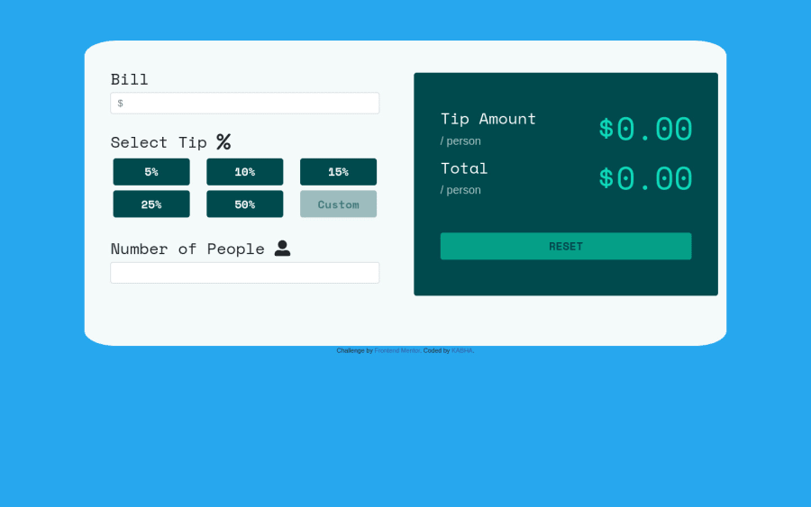
I am so happy to share with you my solution. It will be nice of you to review my code and give feedback. thank you. <Updated version>
Community feedback
- @VastagonPosted about 3 years ago
I thought the custom rectangle was supposed to be a number entry for a custom percentage. Pretty good overall.
Marked as helpful0 - Account deleted
Hi,
Nice one on completing the challenge, the functionality is pretty good;
- The design is where things fell short, like when you resize the window the buttons are almost non-existent, so you fix should fix how the content shift to fit on different screen sizes.
- There's too much things to say... I'll only mention a few;
- For the icons that are supposed to be in the input's,
human & dollar sign iconyou can usebackground-imageto place them inside, that's how I also did it. - On the input add
text-align : rightfor the text inside to start fromright to left, and also you forgot to add the font on it. - You are also supposed to restrict the input on all of the boxes to numbers, letters shouldn't be allowed.
- I'll just stop there, the functionality is good though you just need put more time into getting it as close to the design as possible.
Keep coding👍.
Marked as helpful0@kabhamoPosted about 3 years ago@thulanigamtee Thank you so much I appreciate your feedback. I will make sure to fix it.
0
Please log in to post a comment
Log in with GitHubJoin our Discord community
Join thousands of Frontend Mentor community members taking the challenges, sharing resources, helping each other, and chatting about all things front-end!
Join our Discord
