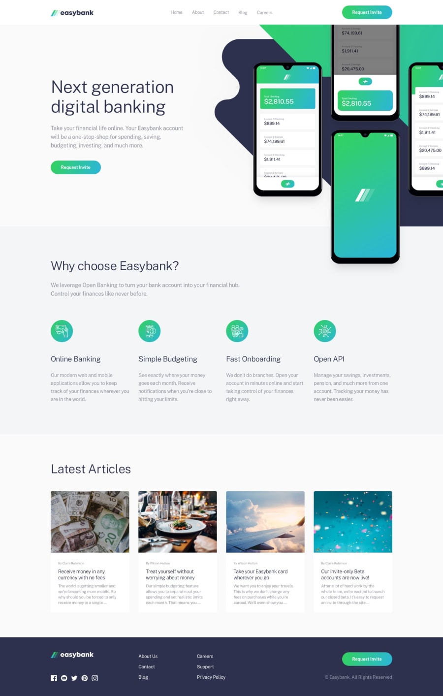
Design comparison
Solution retrospective
This is my first project I think I made it as shown.
Community feedback
- Account deleted
Good job on completing your first challenge.
What I first noticed is that the images in the intro section are creating a horizontal scroll, which should not be there. I think setting the container that they are in to
overflow:hiddenshould work, usually does for me.And another thing that happens is that when you activate the mobile menu, and then switch to desktop while still active, the mobile menu and the overlay stays on there, instead of being dismissed. I think you should fix it.
Keep coding👍.
1@YksRocksPosted over 3 years ago@thulanigamtee thanks for your review, 😇 i tried by setting overflow:hidden but it is not working I tried all the things tha i can but still I can't able to know what is going wrong😞. So therefore I made this as I can and than jumped to my next project 😅.
0
Please log in to post a comment
Log in with GitHubJoin our Discord community
Join thousands of Frontend Mentor community members taking the challenges, sharing resources, helping each other, and chatting about all things front-end!
Join our Discord
