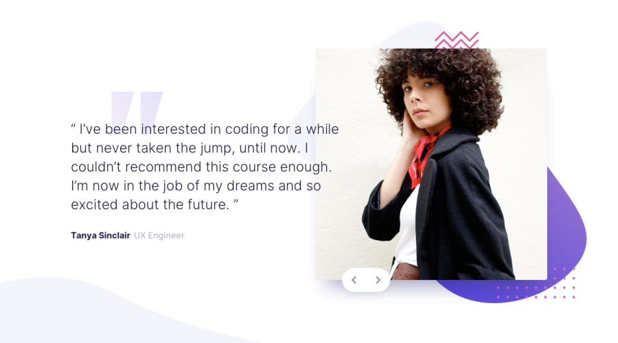
Design comparison
SolutionDesign
Solution retrospective
Thanks for your comments and tips! :)🙌
Community feedback
- @ApplePieGiraffePosted almost 4 years ago
Hey, good work on this challenge, Xavier Guzman! 👏
Your solution looks good and is responsive and those intro animations are cool! 😎
I suggest,
- Transitioning to a mobile layout a little sooner than 968px so that the content of the page doesn't look too squeezed and a horizontal scroll bar doesn't appear along the bottom of the page right before the layout changes.
- Adding
cursor: pointerto the slider buttons.
Keep coding (and happy coding, too)! 😁
0
Please log in to post a comment
Log in with GitHubJoin our Discord community
Join thousands of Frontend Mentor community members taking the challenges, sharing resources, helping each other, and chatting about all things front-end!
Join our Discord
