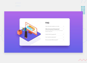
Design comparison
SolutionDesign
Solution retrospective
Hi, I'm a newbie so I would appreciate any feedback:)
Community feedback
- @tedikoPosted over 3 years ago
Hello, elalmamia! 👋 Well done on this challenge! It is really well done. I really like the box animation on hover.
- Try to work on the proper class naming. Your classes aren't descriptive and also hard to read in the code. One of many benefits of proper class naming is that you know what to expect from a certain class without looking at code, even if you aren’t the person who created it or if it was written a long time ago. The name of a selector should be self-descriptive and readable. For example
.card-rightcan be name.accordionetc. - Add
:focuspseudo class to interactive elements like anchors, buttons and inputs in your case. Useoutlineproperty to make your website more accessible to keyboard users. Focusable elements like anchor, buttons or inputs they have applied default:focuspseudo class withoutlineproperty. These default styles are subtle and hardly visible tho. Furthermore every browser has a slightly different default style for the outline, so you probably want to change the default style. Read more about why we should change focus styles.
Keep up the good work! 💪
0 - Try to work on the proper class naming. Your classes aren't descriptive and also hard to read in the code. One of many benefits of proper class naming is that you know what to expect from a certain class without looking at code, even if you aren’t the person who created it or if it was written a long time ago. The name of a selector should be self-descriptive and readable. For example
- @AbePlaysPosted over 3 years ago
Definitely doesn't look like a newbie's work. Good job!
0
Please log in to post a comment
Log in with GitHubJoin our Discord community
Join thousands of Frontend Mentor community members taking the challenges, sharing resources, helping each other, and chatting about all things front-end!
Join our Discord
