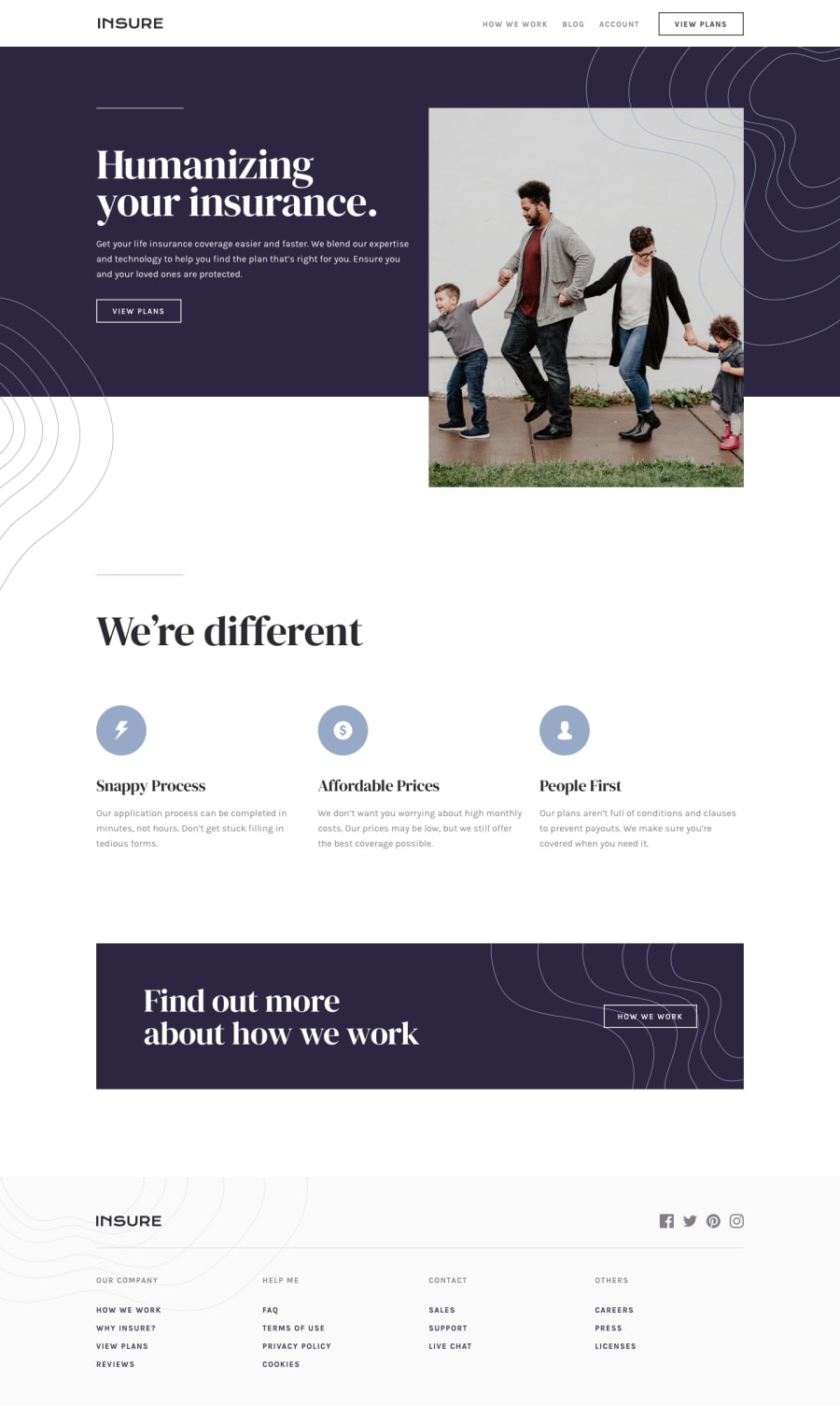
Design comparison
Community feedback
- @TheDeolaPosted over 2 years ago
Welldone Ubong! I think you did great overall but I observed you might be struggling with background image positioning as well as landmarks. Here's a link to an article that helped me better understand how to navigate CSS background-position styling: https://medium.com/@aadetunji012/how-to-improve-your-css-styling-skills-c9010a59287e
Marked as helpful1 - @mubizzyPosted over 2 years ago
Excellent job on this challenge! your report has a few issues though:
- wrap everything in your body in
<main>or use semantics
2. it is a best practice to use both HTML 5 and ARIA landmarks to ensure all content is contained within a navigational region.
Hope it helps:)...don't forget to mark it as helpful 👍
You can get more details here...click here
Marked as helpful0 - wrap everything in your body in
Please log in to post a comment
Log in with GitHubJoin our Discord community
Join thousands of Frontend Mentor community members taking the challenges, sharing resources, helping each other, and chatting about all things front-end!
Join our Discord
