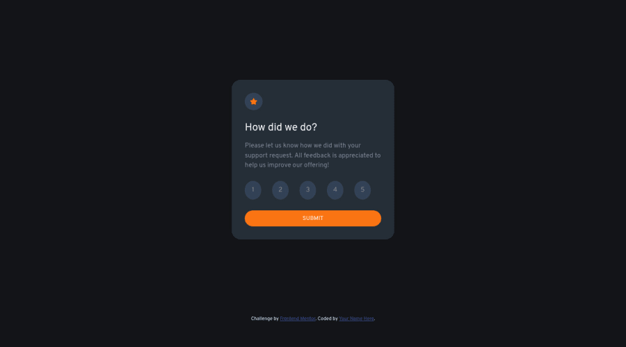
Design comparison
SolutionDesign
Solution retrospective
Please provide suggestions and improvements for my code. It would be really helpful. 😊
Community feedback
- @ereljapcoPosted over 2 years ago
Re: styles
- The
selectshould be be light grey colored, while thehoverstate should be the orange colored - You forgot to add
cursor: pointer - You forgot the hover state for the submit button
Re: accessibility
- wrap your main contents with the
maintag - wrap your attribution with the
footertag - since the image is for decorative, you could add
alt=""
More information regarding accessibility here https://www.w3.org/WAI/tutorials/images/
Overall, great job on finishing the challenge! Hope to see more finished challenges from you :)
Marked as helpful0 - The
Please log in to post a comment
Log in with GitHubJoin our Discord community
Join thousands of Frontend Mentor community members taking the challenges, sharing resources, helping each other, and chatting about all things front-end!
Join our Discord
