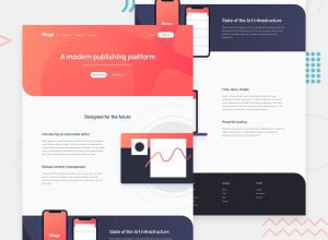
Design comparison
SolutionDesign
Solution retrospective
Finally completed!!
What should I improve?
Looking forward to your suggestions.
Community feedback
- @elalmamiaPosted over 3 years ago
Hey congrats! Not so long ago I did the same one so I know it looks easier than it actually is:) Youd check out the mobile version. The two mobiles image is messing up with the width. So maybe try to change the width to 100%. And the nav menu signUp-card is to narrow in the mobile version. I would also change the width to 90% at least.
0@akshay488Posted over 3 years ago@elalmamia
Yaeh! that was a tricky one. I will try to rebuild it, thank you.
0
Please log in to post a comment
Log in with GitHubJoin our Discord community
Join thousands of Frontend Mentor community members taking the challenges, sharing resources, helping each other, and chatting about all things front-end!
Join our Discord
