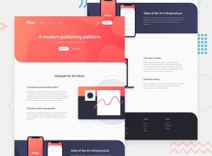
Design comparison
Solution retrospective
It was a bit more difficult than i thought:) I would appreciate any advice how to make my code look better.
Community feedback
- @elalmamiaPosted over 3 years ago
Thanks for the tip! I did change it and it does look better:)
0 - @pikapikamartPosted over 3 years ago
Hey, good work on this one. There are no apparent issues that I saw and the layout both desktop and mobile is really good.
Just a quick suggestion, on your first breakpoint, the mobile state. When I open up the menu bar, the dropdown stays on the right side and have a fixed width. I think it will be better if that dropdown occupies more width, using like
width: calc(100% - 4rem);on yournav-mobileso that it scales on the browser's changes in width.Again, really good work on this ^^
0
Please log in to post a comment
Log in with GitHubJoin our Discord community
Join thousands of Frontend Mentor community members taking the challenges, sharing resources, helping each other, and chatting about all things front-end!
Join our Discord
