Design comparison
SolutionDesign
Solution retrospective
What are you most proud of, and what would you do differently next time?
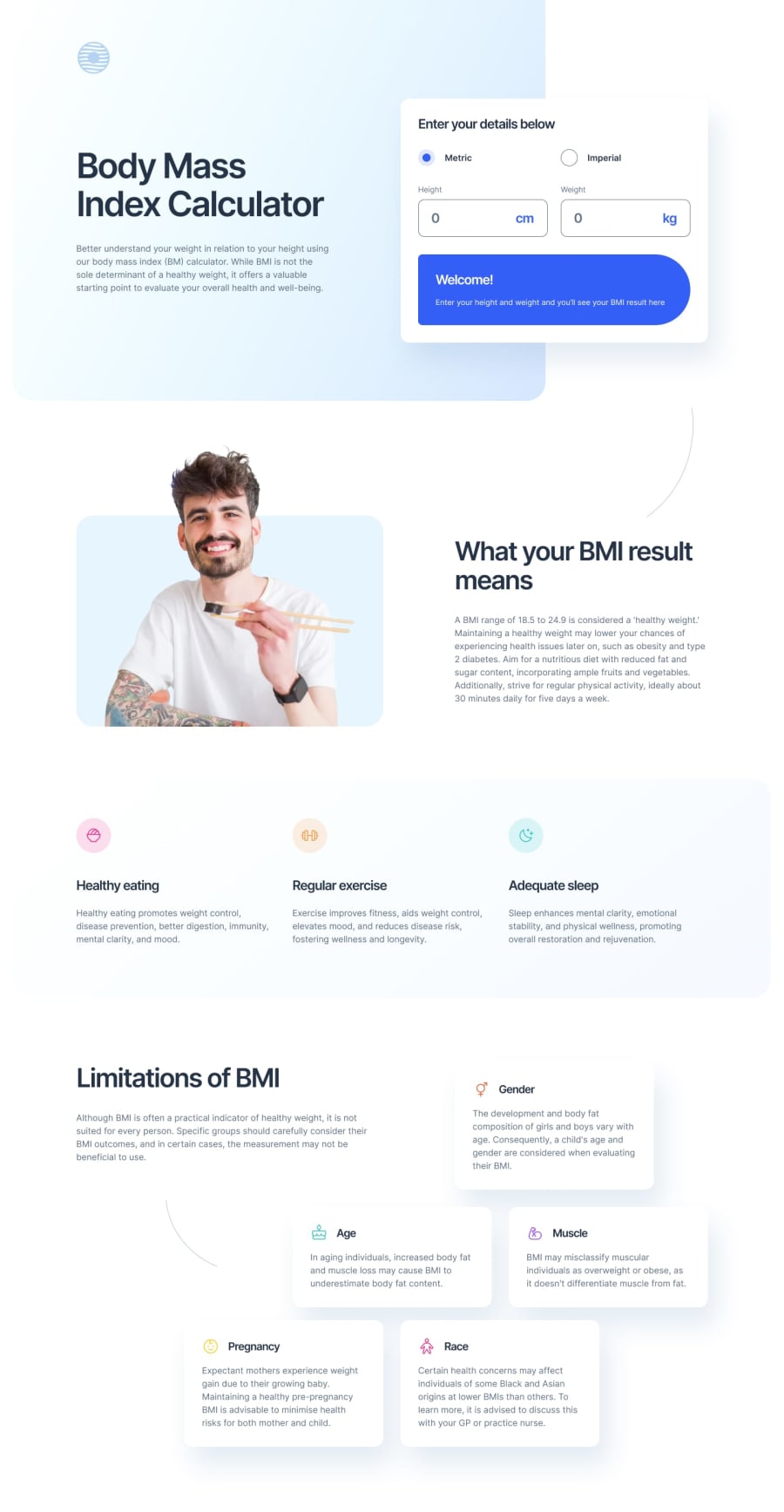
I'm happy with how I managed the site to be responsive to different break points. Also styling the form got me digging for some new solutions.
What challenges did you encounter, and how did you overcome them?Struggled a bit with the bottom section and its layout.
What specific areas of your project would you like help with?any feedback is more than welcome :)
Community feedback
Please log in to post a comment
Log in with GitHubJoin our Discord community
Join thousands of Frontend Mentor community members taking the challenges, sharing resources, helping each other, and chatting about all things front-end!
Join our Discord
