Design comparison
Solution retrospective
showing and success page and get back to main-container
Community feedback
- @matbac85Posted 7 months ago
Hello !
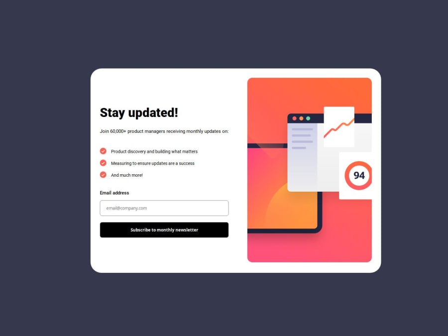
I see that you haven't followed the design completely. The error message should be next to the label with the same typeface, but in red, and the edge of the input and its background should also be in red.
In the mobile version, it seems to me that there are extraneous margins. Don't hesitate to use a CSS reset to remove the default settings.
Your HTML is well coded. I can see that you attach importance to using semantic tags. That's really good.
I've also just done this challenge and one of my friends, who's an experienced developer, advised me to do this challenge on two HTML pages, one page with the form and another that you arrive at when the form is submitted. The information submitted can be retrieved in the params. Initially, I coded my solution in the same way as you.
Apart from that, on the whole, it looks great. Well done and all the best for the future.
Marked as helpful1
Please log in to post a comment
Log in with GitHubJoin our Discord community
Join thousands of Frontend Mentor community members taking the challenges, sharing resources, helping each other, and chatting about all things front-end!
Join our Discord
