Design comparison
SolutionDesign
Solution retrospective
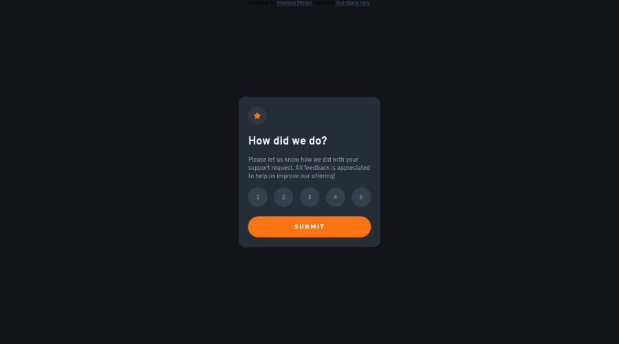
This time I changed regular buttons into radio buttons, and it seems to be a better option. Take a look, and give suggestions.
Community feedback
- @nikavolkPosted over 2 years ago
I think it looks great!
The only thing I would suggest implementing, is a way to prevent the user being able to submit without choosing a rating 😊 I did it by disabling the submit button, but you could throw an error message instead.
Marked as helpful1
Please log in to post a comment
Log in with GitHubJoin our Discord community
Join thousands of Frontend Mentor community members taking the challenges, sharing resources, helping each other, and chatting about all things front-end!
Join our Discord
