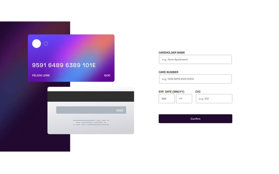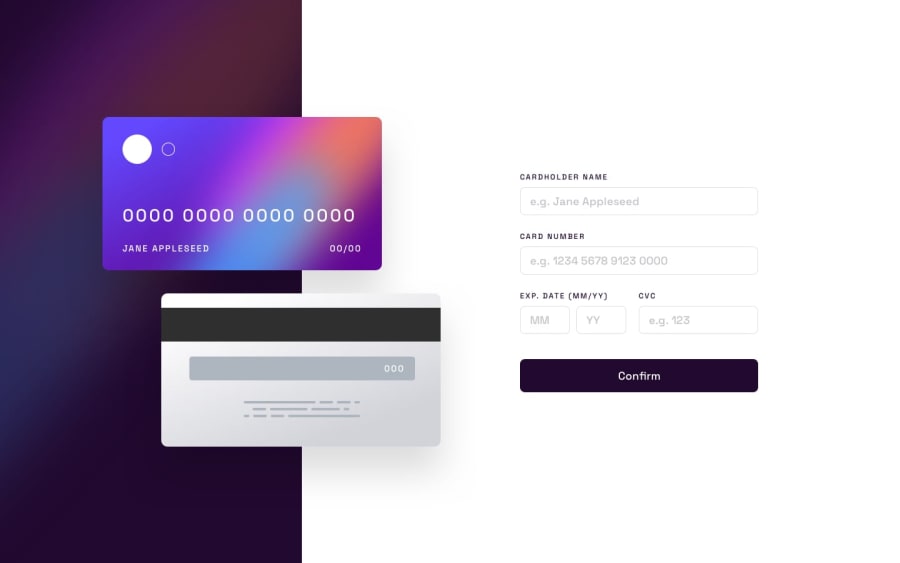
Design comparison
Solution retrospective
the most challenging part of this project is the implementation of the card number that has a format of a letter at the end.i'm a little bit confused on the result and the error message that says "wrong format, numbers only" but then on the output it should have a letter at the end.so i decided to follow the format that will be printed.
What specific areas of your project would you like help with?any suggestions or feedback on this project will be much appreciated.😊
Community feedback
- P@Lo-DeckPosted 6 months ago
Hi well done for this challenge,
I'll give this link you check out the mistake for HTML and CSS. 3WC validator.
It's better to use
emorreminstead ofpx. FreeCodeCamp. FreeCodeCamp.It's easier to start with a mobile-approach FreeCodeCamp.
I don't know what do you mean with the letter at the end, when you look at the challenge, it's an example for the
active state. It's when you display an error.And it's better to use
remoremfor thefont-sizewith my screen the text goes out of the card, try with the webtool and a size above 2200.Hope to be helpful.
Marked as helpful0 - @adriantech-beepPosted 6 months ago
@lo-deck thank you for this kind of suggestion.rigth now i'm still practicing on the responsiveness and still a little lost.i will implement this kind of approach to make it more better.thank you.happy coding.❤️
0
Please log in to post a comment
Log in with GitHubJoin our Discord community
Join thousands of Frontend Mentor community members taking the challenges, sharing resources, helping each other, and chatting about all things front-end!
Join our Discord
