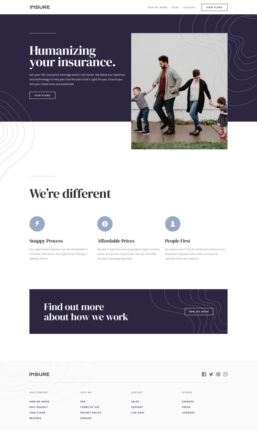
Design comparison
Solution retrospective
feedbacks appreciated! :)
Community feedback
- Account deleted
Good job on completing the challenge.
Your mobile view starts at 1439px, which I think is a bit too drastic, but if you think it works, then it's ok.
The image is too stretched out, and it feels weird having all that space and deciding to do an early mobile view. The pattern on the mobile menu should be given a certain height that it won't be able to go over.
Keep coding👍.
Marked as helpful1@benjaminli7Posted over 3 years ago@thulanigamtee thank you for the feedback sir, I will try to improve! :)
0 - @MohamedIbrahim13Posted over 3 years ago
Very nice work indeed 👍
mobile view should start below 600px.
Images should be fluid (height & width : 100% of its containers).
Review the html report issues.
Thank you!
Marked as helpful0
Please log in to post a comment
Log in with GitHubJoin our Discord community
Join thousands of Frontend Mentor community members taking the challenges, sharing resources, helping each other, and chatting about all things front-end!
Join our Discord
