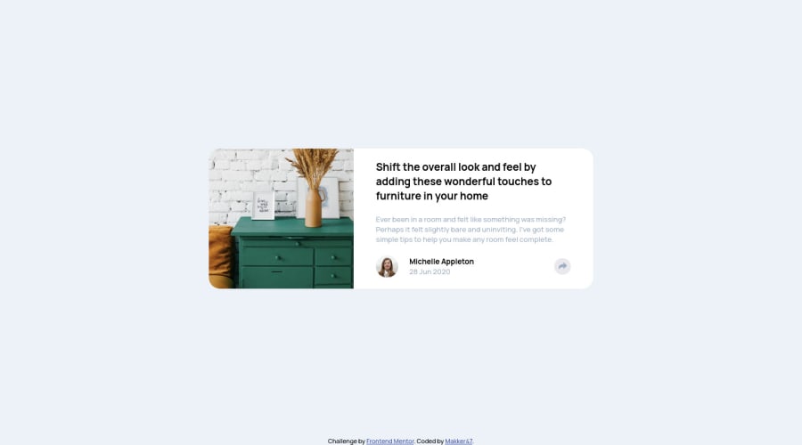
Design comparison
Solution retrospective
Hi, just finished my code, probably hardest Javascript for me. Difficult found time for my self, probably reason long hours work, but I still fighting with that :D
Community feedback
- @0xabdulkhaliqPosted over 1 year ago
Hello there 👋. Congratulations on successfully completing the challenge! 🎉
- I have other recommendations regarding your code that I believe will be of great interest to you.
HTML 🏷️:
- This solution generates accessibility error reports, "All page content should be contained by landmarks" is due to
non-semantic
markup, which lack landmark for a webpage
- So fix it by replacing the
<article class="article_card">
element with the semantic element<main>
along with<div class="attribution">
into a<footer>
element in yourindex.html
file to improve accessibility and organization of your page.
- What is meant by landmark ?, They used to define major sections of your page instead of relying on generic elements like
<div>
or<span>
- They convey the structure of your page. For example, the
<main>
element should include all content directly related to the page's main idea, so there should only be one per page
HEADINGS ⚠️:
- This solution has generated accessibility error report due to skipping heading levels
- We want to avoid skipping heading levels, make sure to start with
<h1>
and working your way down the heading levels (<h2>
,<h3>
, etc.) helps ensure that our document has a clear and consistent hierarchy. Read more 📚
- Because skipping heading levels is a poor practice from the perspective of information design, whether we are talking about web pages, books, journal articles, or about anything else. You can not only confuse screen readers but all readers when you don't follow a consistent, logical pattern with your heading structure.
BUTTONS 🖲️:
- And, this solution has also generated accessibility error reports due to lack discernible text for
<button>
element
- The
<button>
must have discernible text that clearly describes the destination, purpose, function, or action for screen reader users.
- Screen reader users are not able to discern the purpose of elements with role="link", role="button", or role="menuitem" that do not have an accessible name.
- The
<button>
name rule has five markup patterns that pass test criteria:
<button id="al" aria-label="Name"></button> <button id="alb" aria-labelledby="labeldiv"></button> <div id="labeldiv">Button label</div> <button id="combo" aria-label="Aria Name">Name</button> <button id="buttonTitle" title="Title"></button>
-
Ensure that each
<button>
element and elements withrole="button"
have one of the following characteristics:- Inner text that is discernible to screen reader users.
- Non-empty
aria-label
attribute. aria-labelledby
pointing to element with text which is discernible to screen reader users.role="presentation"
orrole="none"
(ARIA 1.1) and is not in tab order (tabindex="-1"
)
I hope you find this helpful 😄 Above all, the solution you submitted is great !
Happy coding!
1@makker47Posted over 1 year ago@0xAbdulKhalid Hello, thank you for feedback, I saw this error I fix after load page. :))
0@0xabdulkhaliqPosted over 1 year ago@makker47
Glad you found it helpful !, Could you support my work by marking as helpful ? 🤠
Marked as helpful0
Please log in to post a comment
Log in with GitHubJoin our Discord community
Join thousands of Frontend Mentor community members taking the challenges, sharing resources, helping each other, and chatting about all things front-end!
Join our Discord