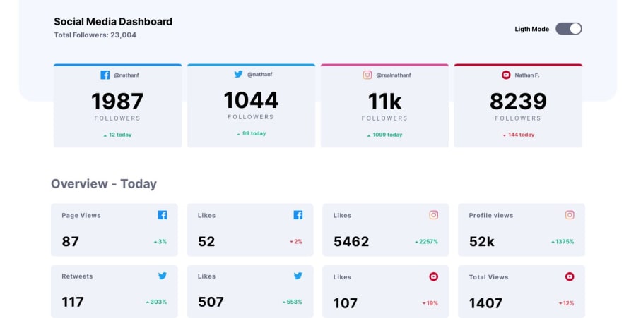
Design comparison
Solution retrospective
Hi folks, finally finished this challenge, javascript it scares me a lot, please be free to comment, thanks.
Community feedback
- @palgrammingPosted over 4 years ago
When the page first loads in "light mode" the word "light" is spelled wrong when the slider is clicked and it cycles back to light mode then the spelling error is corrected
Also seem like the clickable area in the slider should be expanded so I could click where I wanted the slider to go and not just on the circle of the slider
but it looks great so far #GreatJob
2@CtaracenaPosted over 4 years ago@palgramming Thanks a lot, I fixed the spelling of "light" and changed the EventListener to the slider instead the circle. Your comment was very helpful, thank you very much!
1@palgrammingPosted over 4 years ago@Ctaracena Glad to help and the slider is much better now you need someone smarter than me to step it cause it looks good to me
1 - @kfairrisPosted about 4 years ago
Nice work Carlos. I forked your repo to play around with it and I added some CSS transitions to your
switchclass, to animate the toggle switch. I would also make the entire slider trigger the toggle and not just the button. So I changed thebtn.addEventListenertoslider.addEventListenerand that did the trick.I'm not a JS expert, but there seems to be a lot of duplicate items in there that could be combined. How would you accomplish that?
1@CtaracenaPosted about 4 years ago@kfairris Thanks for the improvement, I already merged the changes and I love the slider animation. I'm still learning JS so I don't know how can I resolve the duplicated items yet, sorry for that.
1
Please log in to post a comment
Log in with GitHubJoin our Discord community
Join thousands of Frontend Mentor community members taking the challenges, sharing resources, helping each other, and chatting about all things front-end!
Join our Discord
