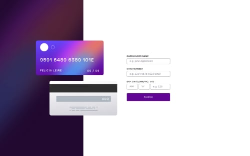
HTML + CSS + Javascript responsive interactive card details form

Solution retrospective
Oh my god, what a challenge this was! This one was, by some margin, the hardest one I did so far. To figure out the design and the Javascript logic in it was very hard for me. I know this was is not perfect, but I had to post it in order to ask for opinions. Here are some of the main problems/concerns I had:
-
How to accept only one space in cardholder name field
-
How to show the correct card number format (with spaces in the card number field)
-
I am not sure if I am using the right patterns for letters and numbers. I noticed that, in the number’s fields, its accepting "-1" or "-", for instance. I tried correcting it with Math.abs(), but it’s not working well..
-
There is an inconvenient error in the function verifyInput (id ‘month’ and id ‘year’), where the error message is not being displayed correctly to the user. It is probably because they are in the same div. Is there a way to fix it without changing the HTML?
-
I tried restricting the input length for the numbers type input, but I couldn't with input type "number" (with min and max attributes), so I used input type "text" instead. I added maxlength to it and it worked. Is there another or a better way of doing it?
Please log in to post a comment
Log in with GitHubCommunity feedback
No feedback yet. Be the first to give feedback on Bernardo Hollmann's solution.
Join our Discord community
Join thousands of Frontend Mentor community members taking the challenges, sharing resources, helping each other, and chatting about all things front-end!
Join our Discord