Design comparison
Solution retrospective
I had some problems with this challenge. Can someone please help me with it?
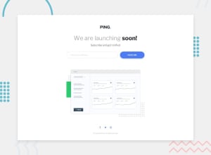
I tried to make to dashboard image shrink better along with the page itself, but I couldn't do it. Its shrinking too much.
The other problem I had was with the icons. I tried using the fontawesome ones, but I couldn't figure out how to make a perfect circle outside of each one.
Community feedback
- @icaroMendes777Posted over 2 years ago
hello!
didnt see major problems, but if I can help you with something:
-the social-media items, they are not perfectly aligned in the center of the circle, you can use flexbox to center them perfectly, like: display: flex;justify-content: center;align-items: center;
-when resizing the main picture size is jumping, go gradually changing the size of the screen to see it. It gets too small around screen 600px, and then when it gets to the cellphone size it grows again. you can put a min-width and min-height for the picture never become smaller than its minimum size.
-when you click in the mail field it adds a weird color border to the field by the html default, you can correct this with css: "outline: none;" on the email field.
but in general the page is quite good. hope this can be useful.
Marked as helpful1@BernardoHollmannPosted over 2 years ago@icaroMendes777 Thanks, friend! It really worked your tip on the social media items and the input outline border!
1
Please log in to post a comment
Log in with GitHubJoin our Discord community
Join thousands of Frontend Mentor community members taking the challenges, sharing resources, helping each other, and chatting about all things front-end!
Join our Discord
